Client Experience
Brands I've worked with.

















Work Samples
-
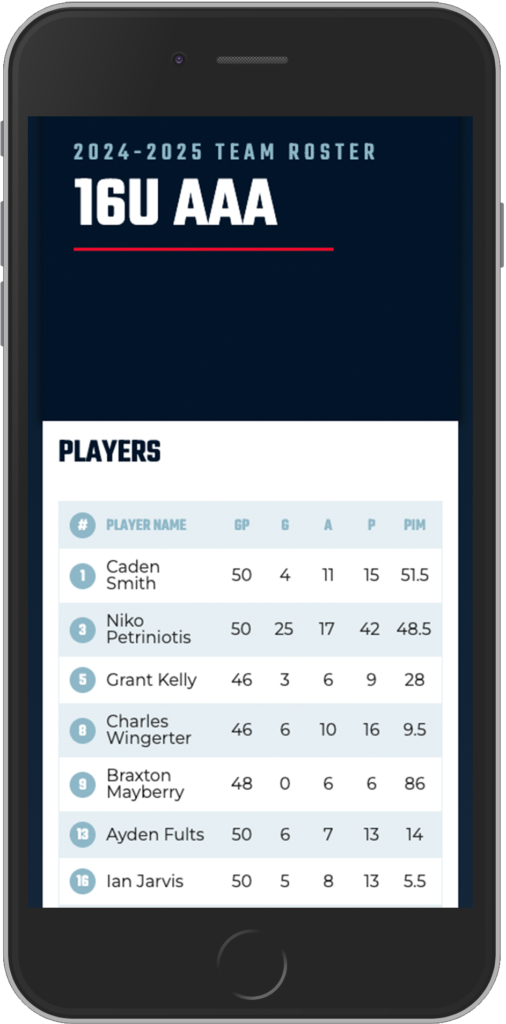
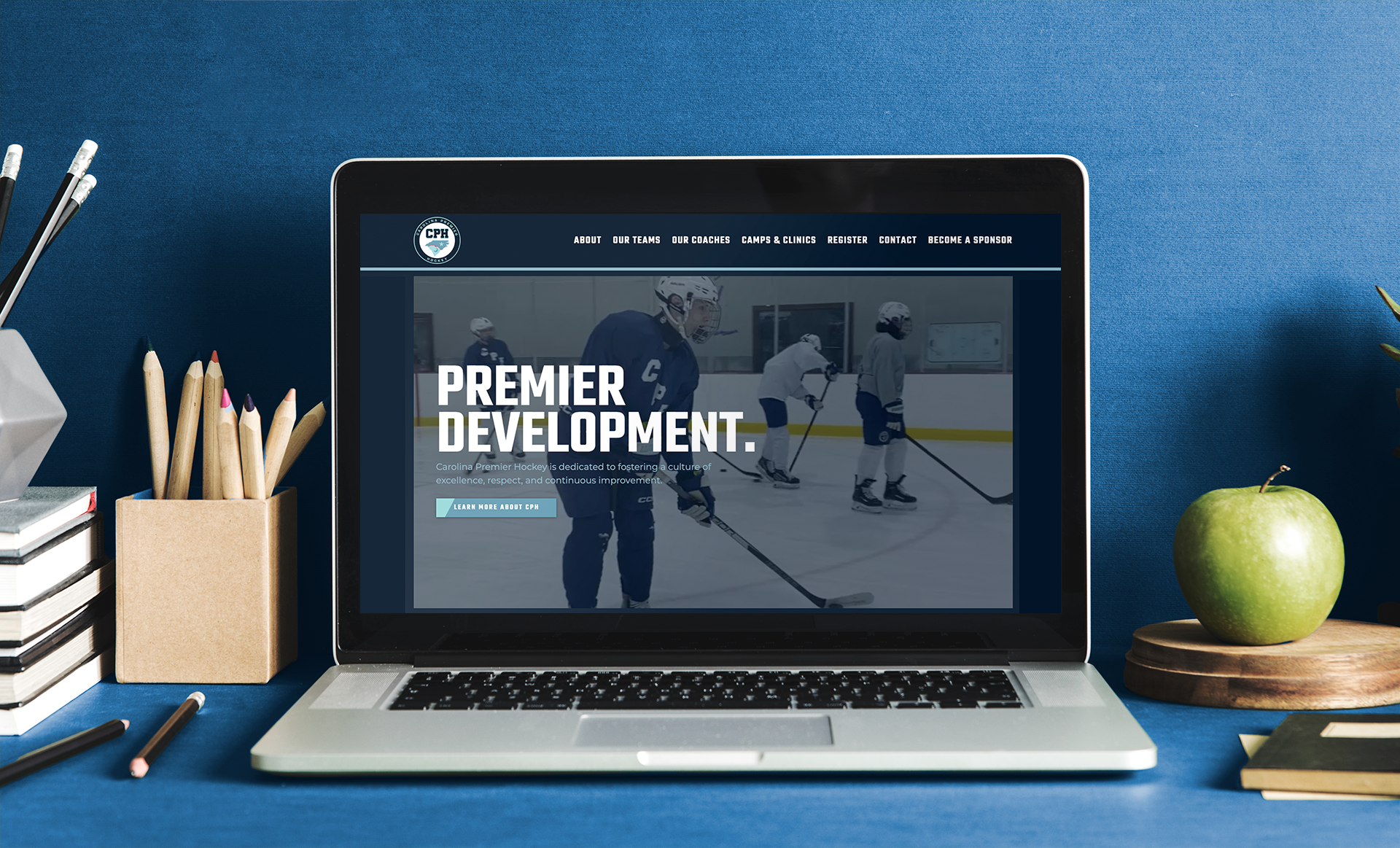 Carolina Premier Hockey
Carolina Premier Hockey
The Challenge
Youth hockey organizations often look remarkably similar online.
Many rely on off-the-shelf platforms that prioritize scheduling and registration but leave little room to communicate what makes the program different. For families evaluating multiple organizations, that makes every option feel interchangeable.
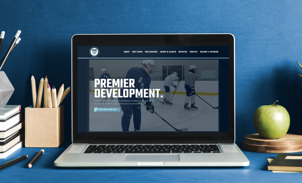
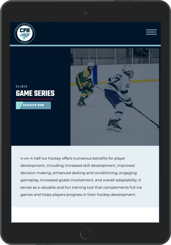
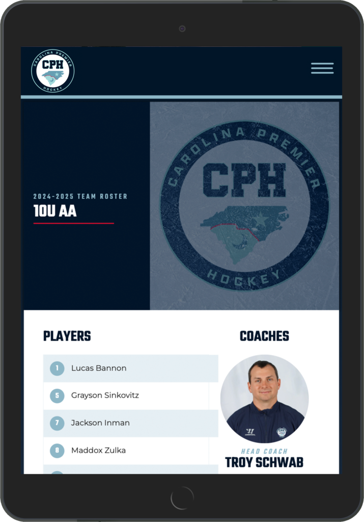
Carolina Premier Hockey needed a website that reflected the quality of its coaching, player development, and competitive culture—not just its schedule.
The Approach
Families don’t choose a hockey program because the website has impressive animations.
They choose a program because they believe it’s the right place for their child.
That meant the website needed to establish credibility immediately.
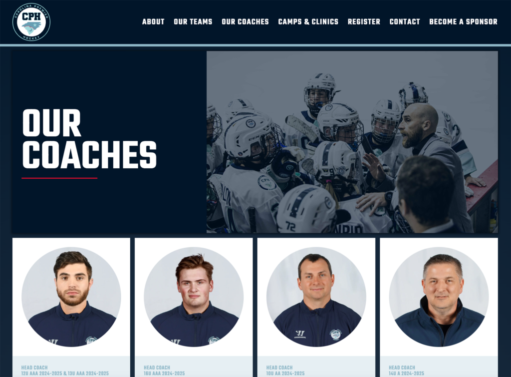
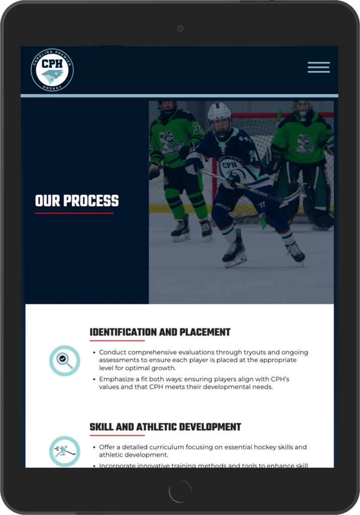
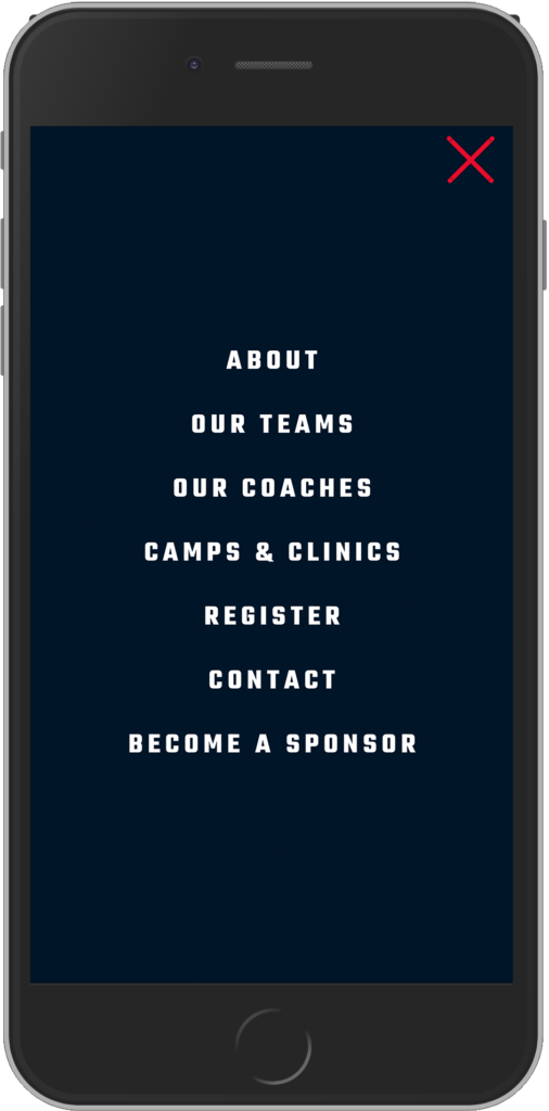
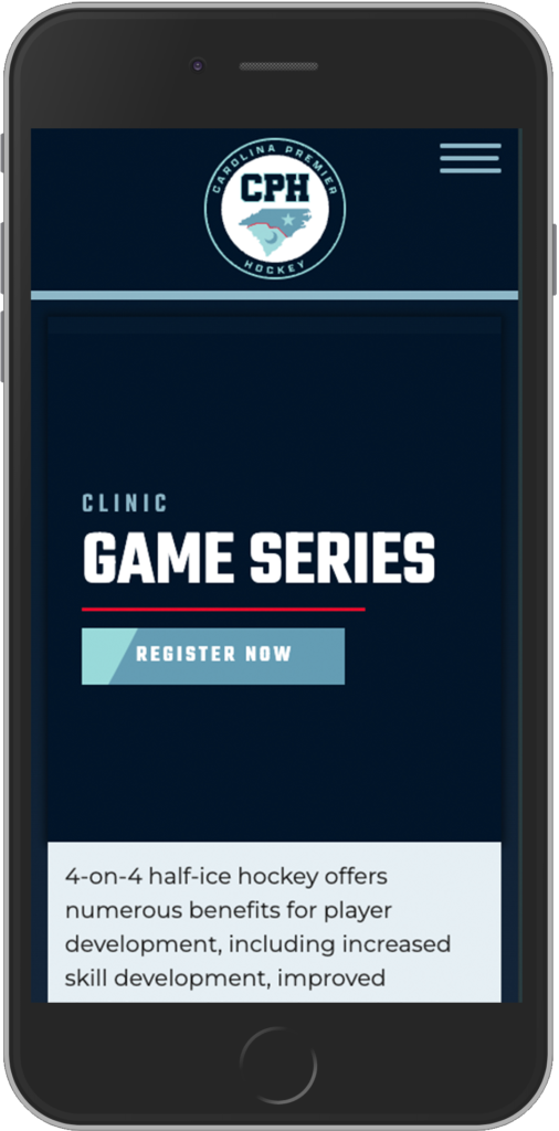
Instead of overwhelming visitors with information, we focused on a clear hierarchy, strong photography, intuitive navigation, and messaging that reinforced the organization’s commitment to player development.
The goal wasn’t simply to look more modern than other hockey clubs.
It was to communicate professionalism, organization, and trust.
The Solution
I designed and developed a fully custom WordPress website that gives Carolina Premier Hockey complete control over its digital presence.
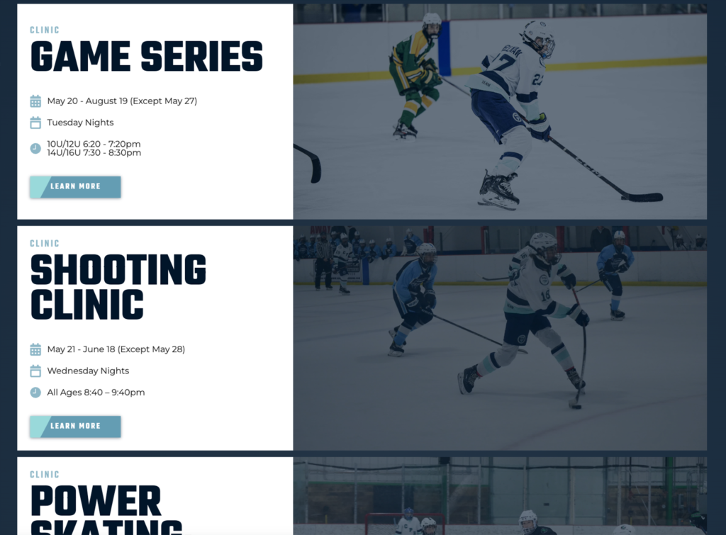
Unlike template-driven sports platforms, the site was built specifically around the organization’s brand, allowing coaches and staff to showcase programs, communicate with families, publish news, recruit players, and evolve the website as the organization grows.
The result is a digital experience that feels every bit as polished as the product on the ice.
Why It Worked
The project wasn’t successful because it looked different.
It succeeded because it made the organization easier to understand.
Parents could quickly find the information they needed.
Prospective players could picture themselves in the program.
The website reinforced the same level of professionalism families experienced once they stepped into the rink.
That’s what good design should do.
-
-
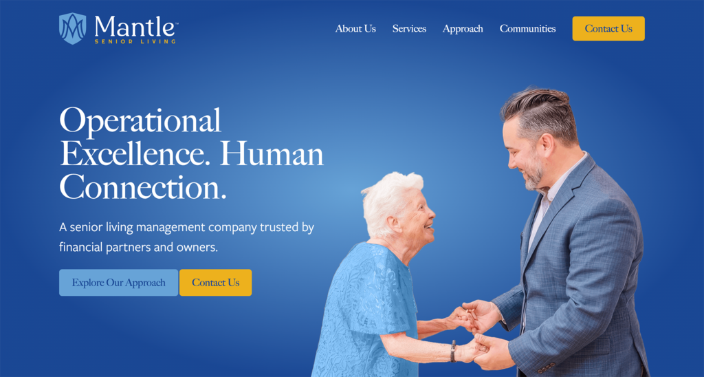
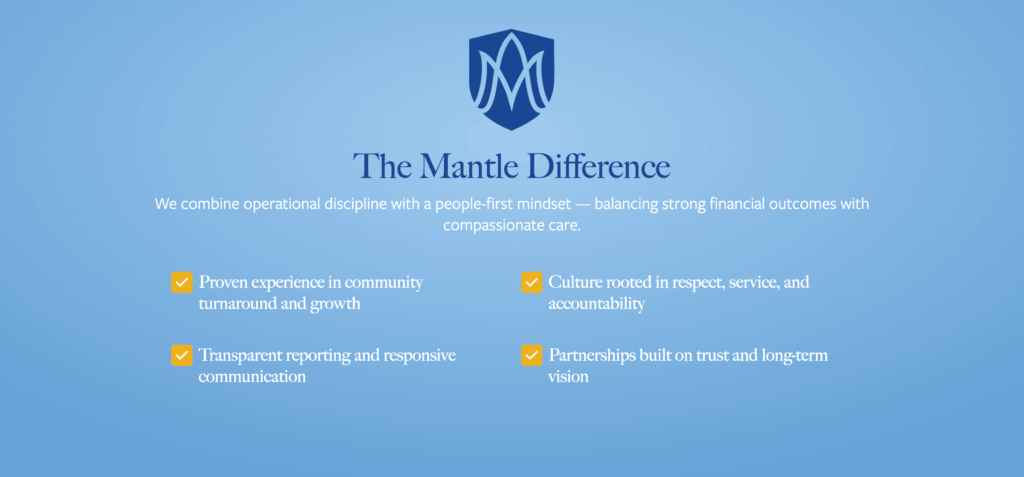
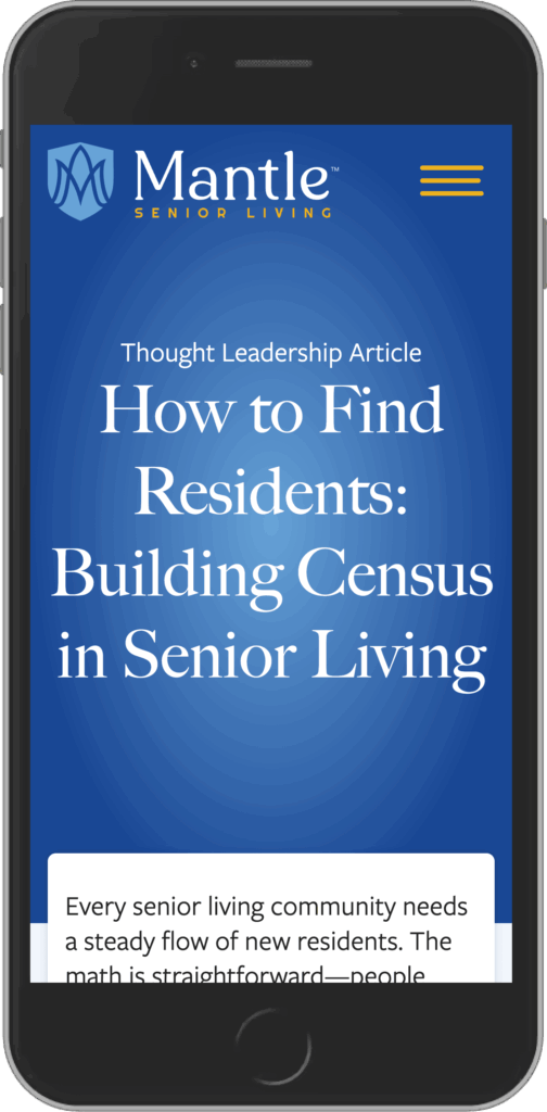
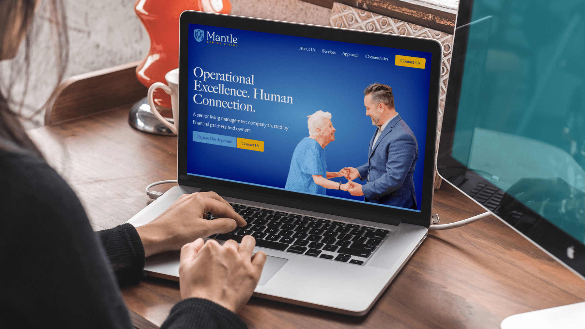 Mantle Senior Living
Mantle Senior Living
The Challenge
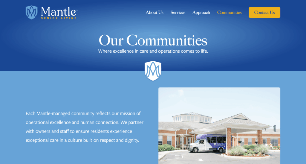
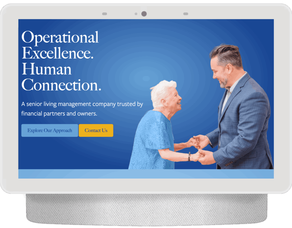
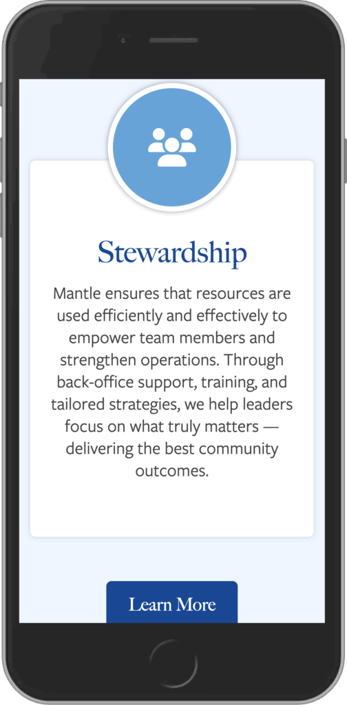
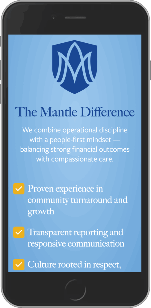
Mantle Senior Living was entering a new chapter. The company had evolved, but its brand and website no longer reflected the quality of care, professionalism, and long-term vision behind the organization.
The challenge wasn’t simply creating a more modern website. It was building confidence with multiple audiences at once. Adult children needed reassurance that their loved ones would receive exceptional care. Seniors needed a welcoming first impression. Investors needed to see an organization capable of thoughtful growth.
Those are emotional decisions, and trust becomes the deciding factor.
The Approach
Senior living is often presented as a list of services, amenities, and floor plans.
I wanted Mantle to feel different.
The strategy centered on creating warmth without sacrificing professionalism. We refined the brand, modernized the visual identity, simplified the user experience, and developed messaging that felt compassionate, confident, and easy to understand.
Rather than overwhelming visitors with information, the website guides them through a journey that answers the questions people are already asking: Who is this company? Can I trust them? Is this the right place for my family?
The Solution
I led a comprehensive brand and website transformation that included a refreshed visual identity, a custom WordPress website, improved information architecture, and a complete content strategy.
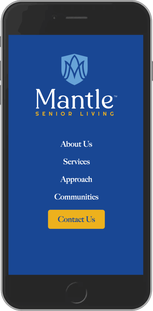
The updated brand introduced a refined logo, an evolved color palette, and a more approachable visual language that reflects the warmth of the Mantle communities while maintaining the professionalism expected by families, operators, and investors.
Behind the scenes, the site was built with a flexible content management system that allows the Mantle team to manage community information, expand as the organization grows, and keep content current without relying on a developer.
My Role
- Brand Strategy
- Brand Identity Refresh
- Logo Design
- UX Strategy
- Information Architecture
- Website Design
- WordPress Development
- Front-end Development
- Content Strategy & Copywriting
- Creative Direction
- Ongoing Website Support
What Made the Difference
The strongest part of this project wasn’t the new logo or the redesigned website.
It was creating clarity around a complicated and emotional decision.
Every design choice, every page, and every piece of copy was built to reduce uncertainty and help visitors feel more confident in the organization behind the brand.
That’s what trust looks like in practice.
Field Notes
Design alone doesn’t convince someone to trust a senior living provider.
Clarity does.
When families can quickly understand who you are, what you value, and how you’ll care for the people they love, good design becomes almost invisible. It simply makes confidence easier to find.
-
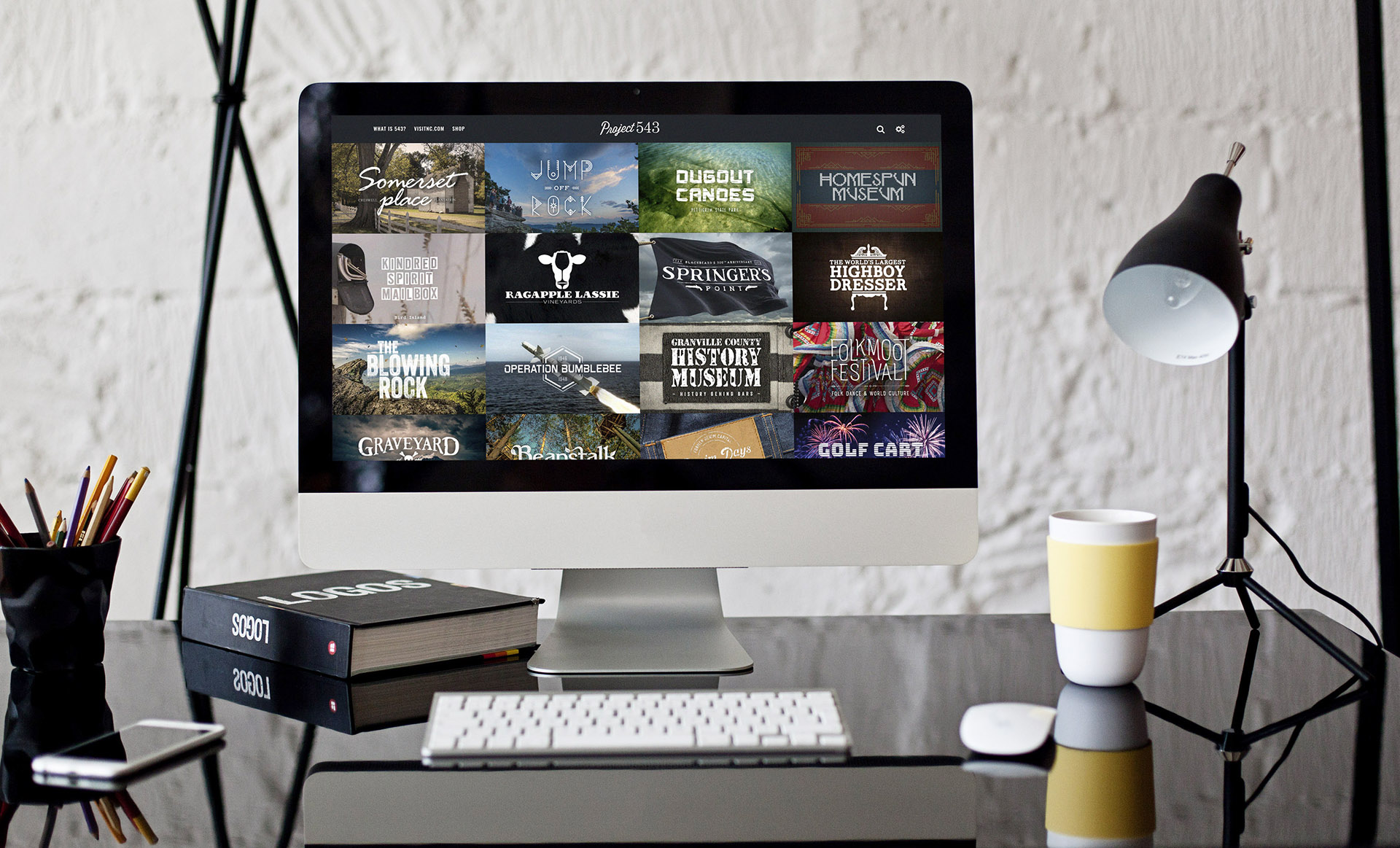 Project 543
Project 543
The Challenge
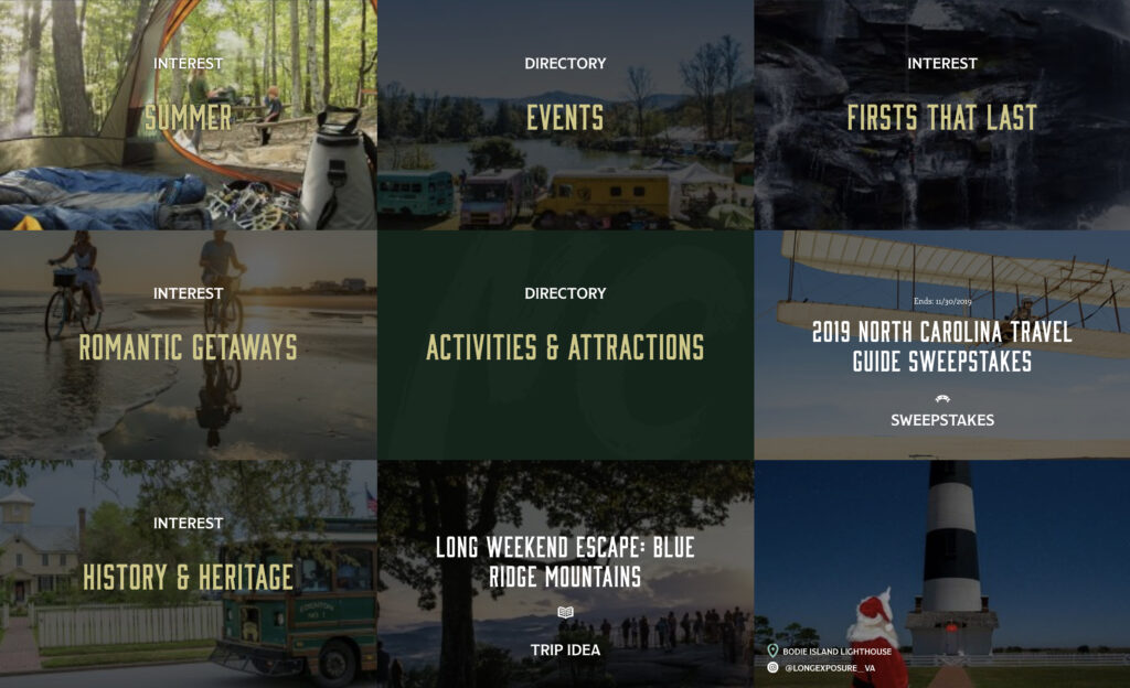
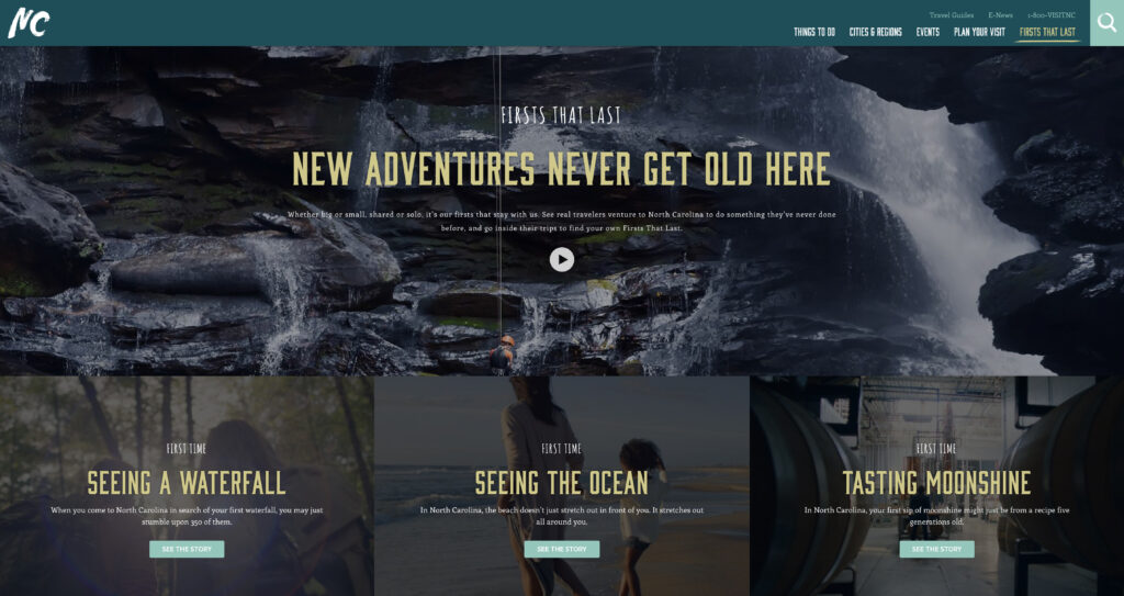
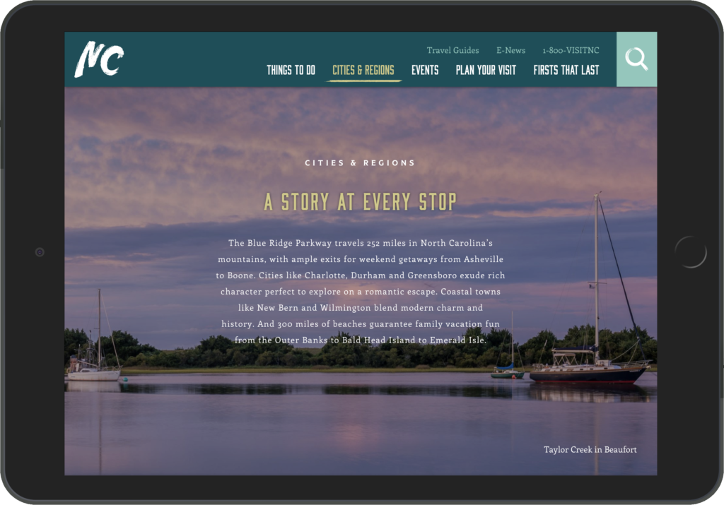
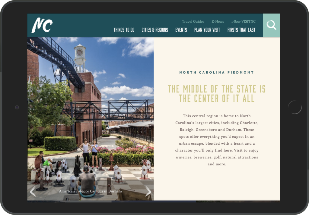
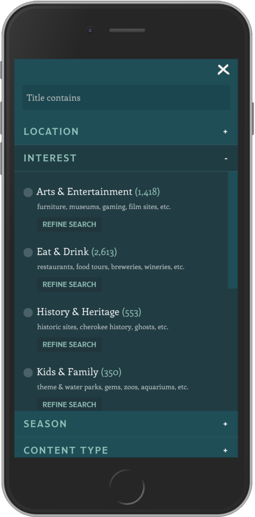
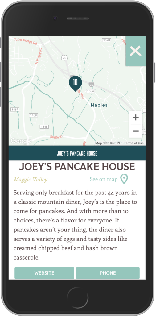
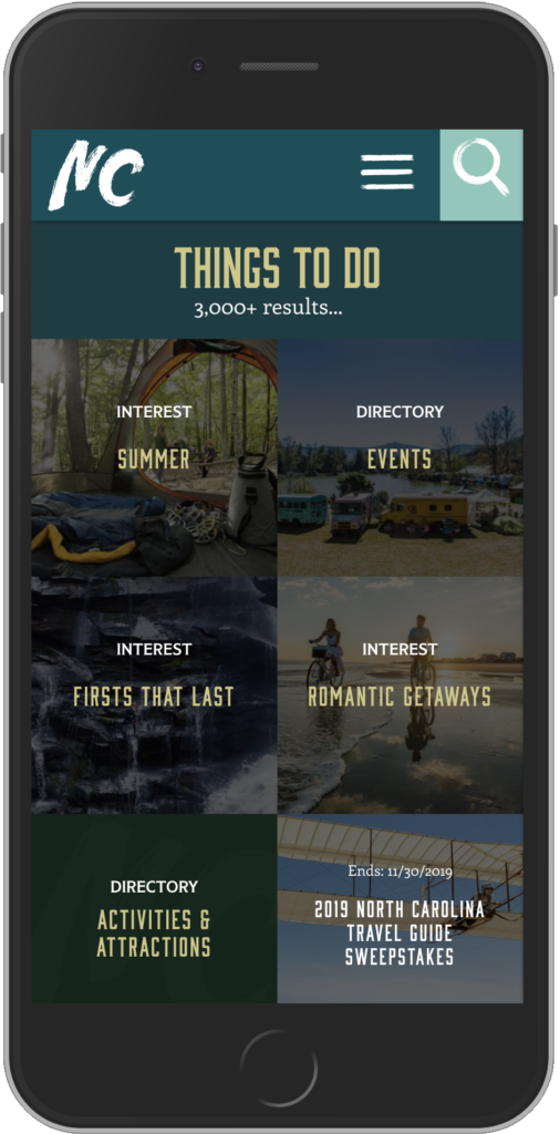
Visit North Carolina wanted to reinvent one of its most ambitious content initiatives: 543 Things to Do in North Carolina.
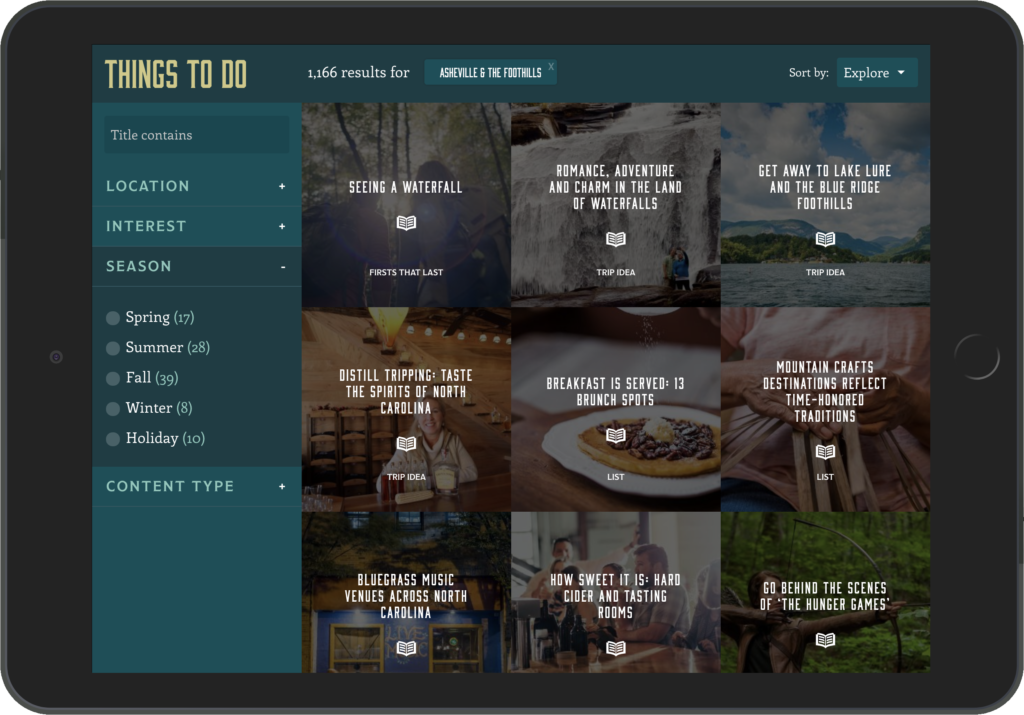
The original concept had become an extensive collection of destinations and attractions, but the experience needed to feel more inspiring, more discoverable, and easier to explore across every device.
The challenge wasn’t organizing hundreds of destinations.
It was transforming a massive library of content into something people genuinely wanted to browse.
The Approach
Travel is emotional.
People rarely choose a destination because of a list of attractions. They choose places they can imagine themselves experiencing.
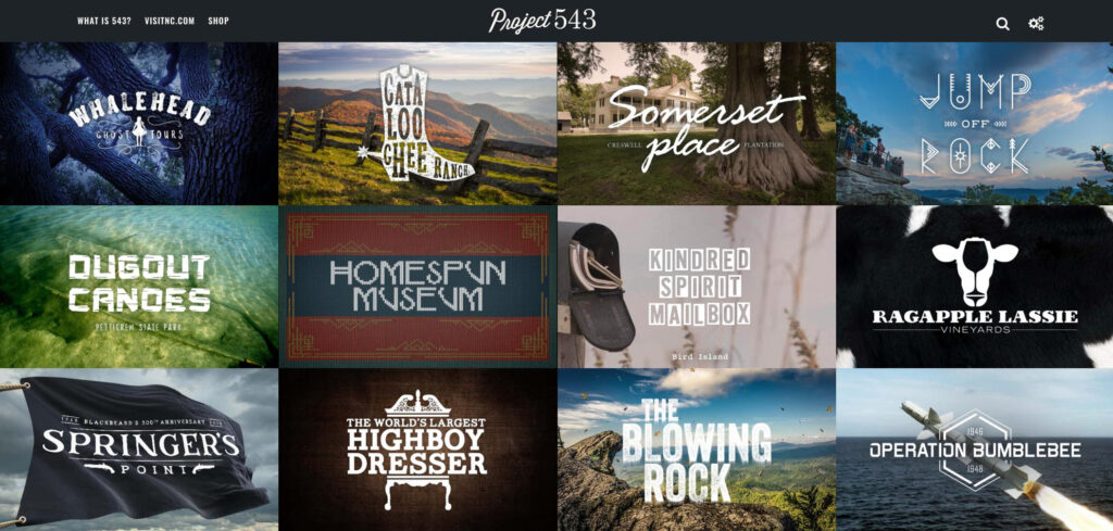
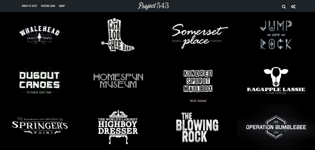
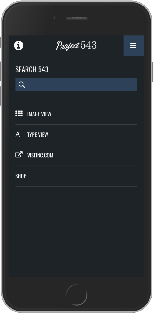
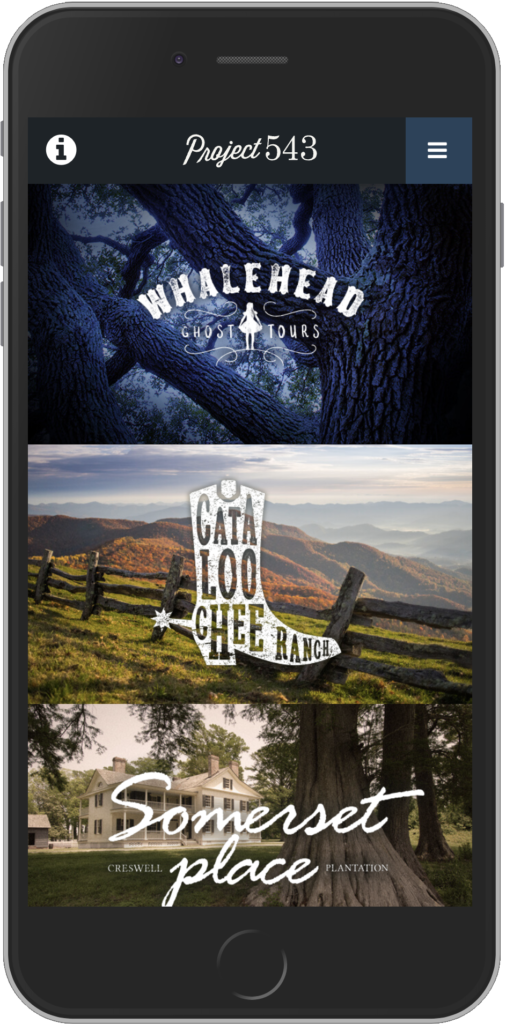
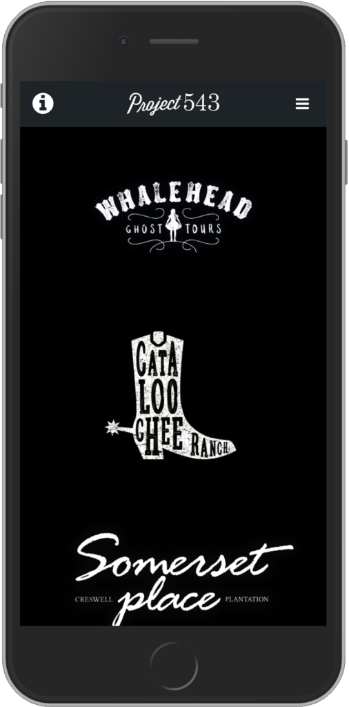
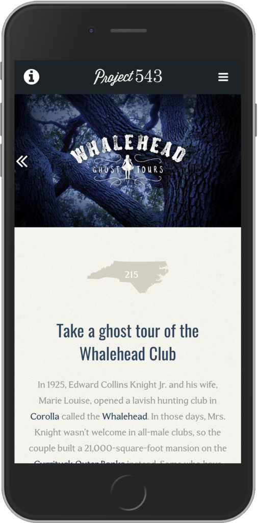
Rather than designing another directory, we approached Project 543 as an editorial experience. Large typography, immersive photography, thoughtful pacing, and responsive layouts encouraged visitors to slow down, explore, and discover places they might otherwise overlook.
Every design decision was intended to make planning a trip feel less like research and more like inspiration.
The Solution
I helped lead the concept, user experience, and creative direction for a completely redesigned digital platform that showcased North Carolina through story-driven content and modern responsive design.
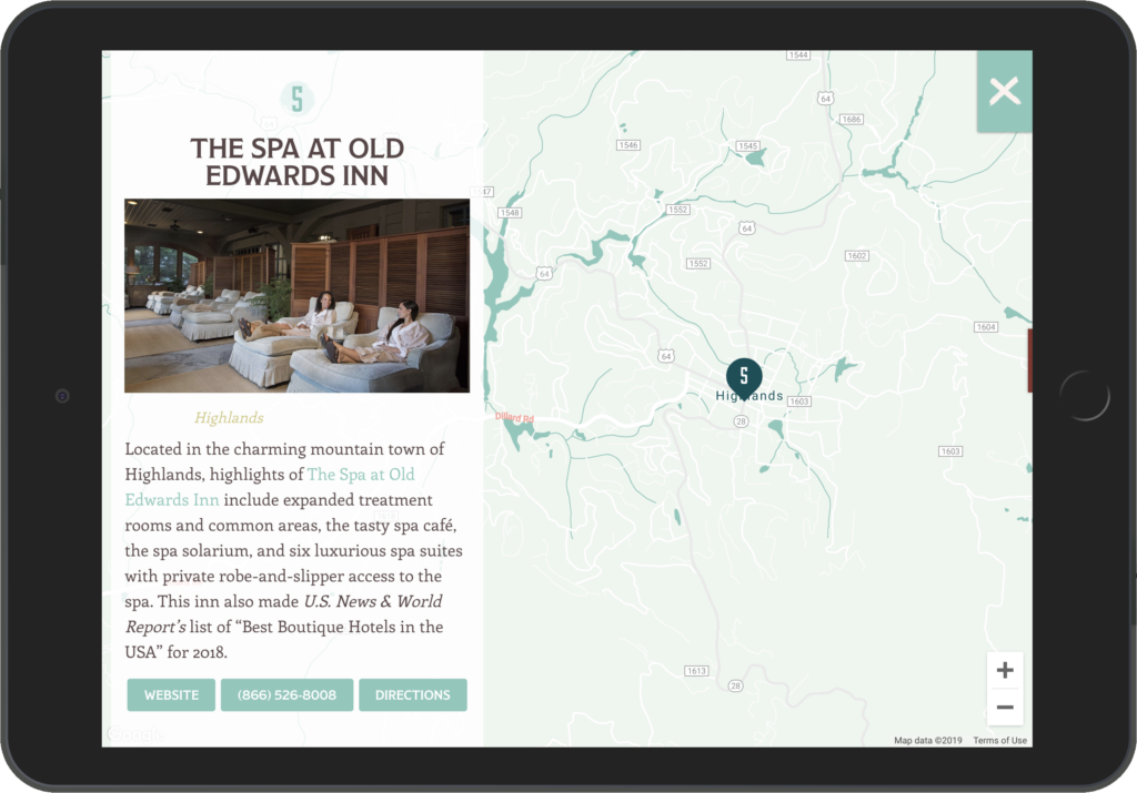
The experience balanced beautiful editorial presentation with practical travel planning, giving visitors the inspiration to explore while making it easy to learn more, plan a visit, and discover nearby destinations.
The result was a platform that celebrated the diversity of North Carolina while giving Visit NC a flexible foundation for publishing future content.
My Role
- Digital Creative Direction
- UX Strategy
- Information Architecture
- Editorial Experience Design
- Responsive Interface Design
- Front-end Development Collaboration
- Creative Concept Development
What Made the Difference
The success of Project 543 wasn’t simply the number of destinations it featured.
It was making hundreds of stories feel approachable instead of overwhelming.
By combining editorial design with thoughtful user experience, the platform invited visitors to explore naturally while giving Visit NC the flexibility to continue growing the experience over time.
Field Notes
The best travel experiences begin long before someone packs a suitcase.
They begin with curiosity.
Good design doesn’t just help people find information. It helps them imagine what’s possible.
-
 North Tryon Tech Hub
North Tryon Tech Hub
The Challenge
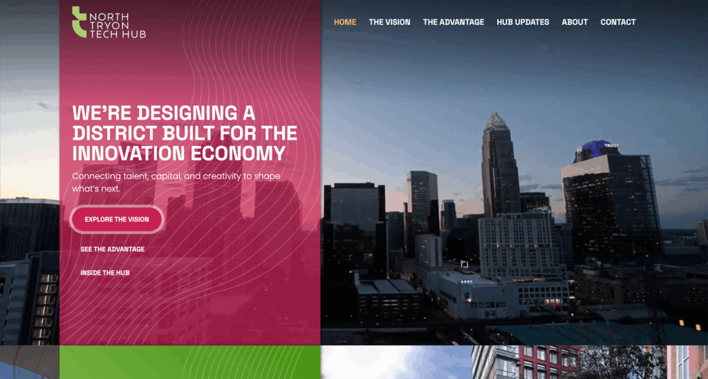
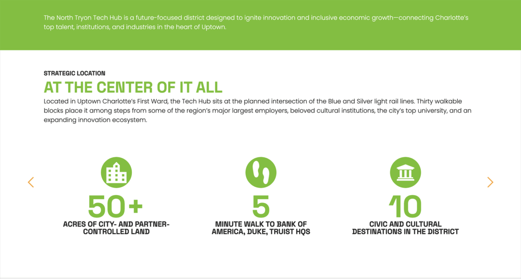
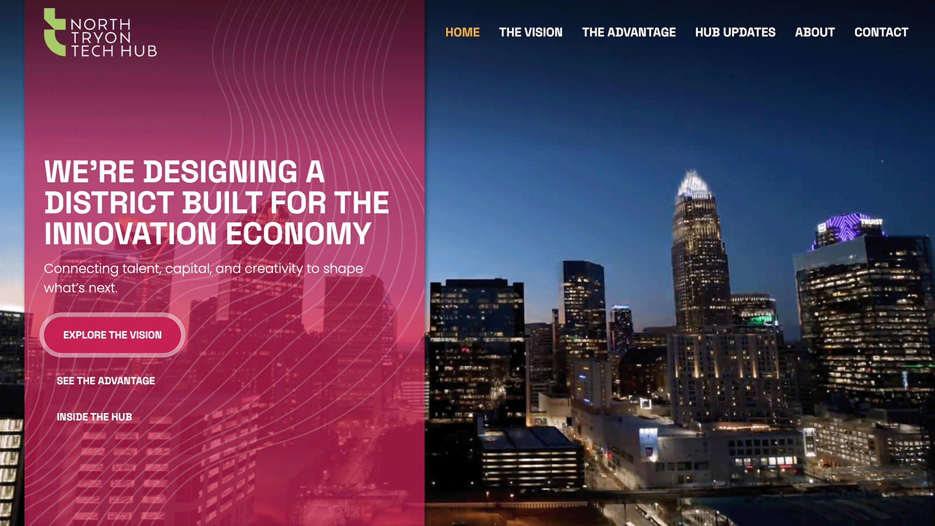
Entrepreneurs and investors needed confidence that Charlotte was serious about becoming a technology destination. At the same time, residents needed to believe that redevelopment would strengthen—not replace—the existing community.
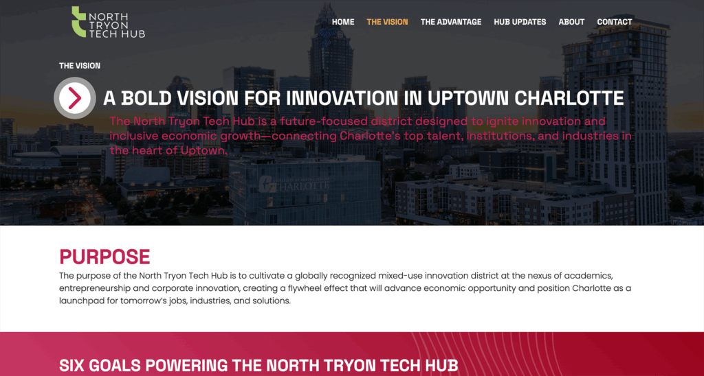
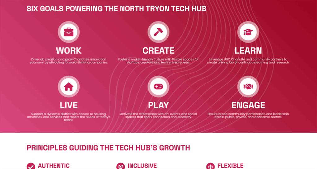
The North Tryon Tech Hub represents one of Uptown Charlotte’s largest and most ambitious redevelopment initiatives—a long-term vision for transforming the district into a center for entrepreneurship, technology, education, and the arts.
Communicating that vision presented a unique challenge.
The website needed to inspire confidence in what was coming while providing practical information about what already existed. It had to speak to investors, startups, residents, public officials, and community partners, each arriving with different questions and different priorities.
Most importantly, it needed to make a complex master plan feel approachable.
The Approach
Economic development projects often become overwhelmed by reports, planning documents, and technical language.
We wanted this experience to feel different.
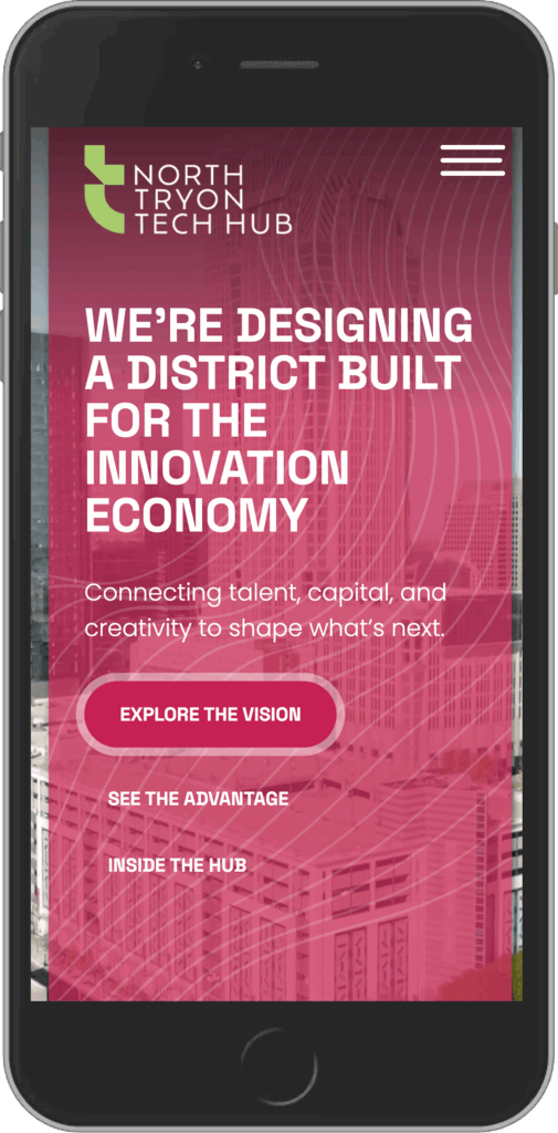
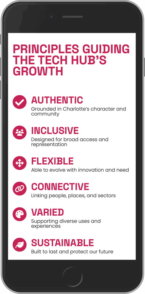
Working alongside Brookhouse Group, I helped shape a digital experience that balanced storytelling with usability. Through thoughtful information architecture, interactive mapping, engaging motion, and carefully structured content, we transformed a large body of evolving information into something visitors could quickly understand and confidently explore.
The goal wasn’t simply to explain the vision.
It was to make people want to be part of it.
The Solution
I led the user experience strategy and digital execution for a custom WordPress website that brings the North Tryon Tech Hub initiative to life.
The experience combines interactive neighborhood maps, dynamic content, photography, motion, and editorial storytelling to communicate both the long-term vision and the momentum already underway.
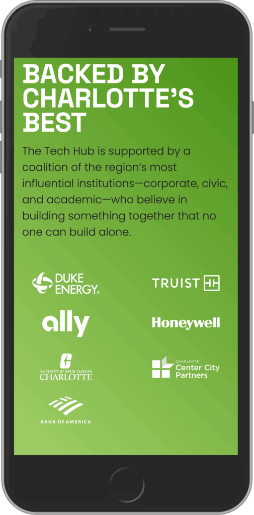
Because the district will continue evolving over many years, the website was built on a flexible content management system that allows Charlotte Center City Partners to update initiatives, partnerships, development milestones, and community resources as the project grows.
My Role
- UX Strategy
- Information Architecture
- Interactive Experience Design
- Content Strategy
- Copy Guidance
- Motion Direction
- Photography Curation
- WordPress Development
- Creative Collaboration with Brookhouse Group
What Made the Difference
The greatest challenge wasn’t presenting information.
It was creating excitement around something still being built.
By combining interactive storytelling with intuitive navigation, the website transforms a complex redevelopment initiative into a vibrant digital experience that invites visitors to imagine what’s next instead of simply reading about it.
Field Notes
People don’t invest in maps.
They invest in possibility.
Good design helps people understand where a vision is going—and gives them confidence they want to be part of the journey.
-
 Catholic Coffee
Catholic Coffee
The Challenge
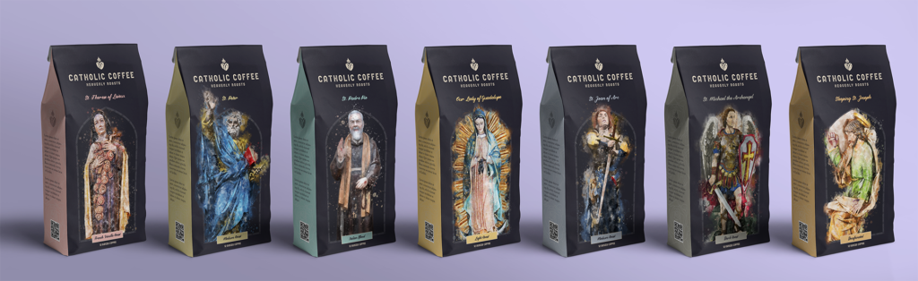
Faith-inspired brands have to earn more than attention. They have to earn authenticity. Catholic Coffee needed to feel rooted in the richness of the Catholic tradition while standing alongside premium specialty coffee brands.
Creating another coffee label wasn’t the goal.
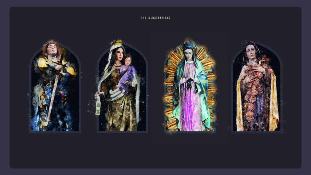
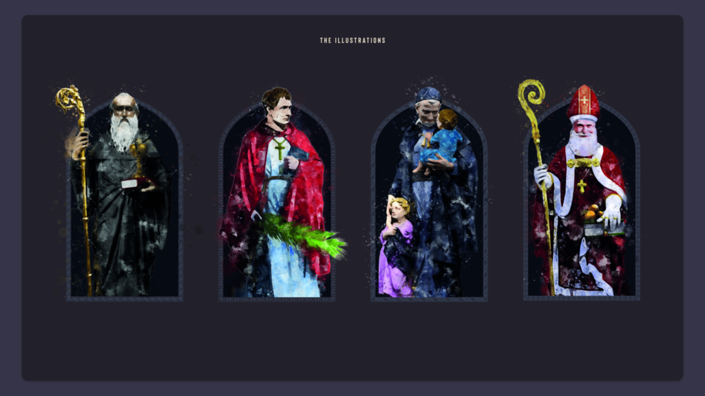
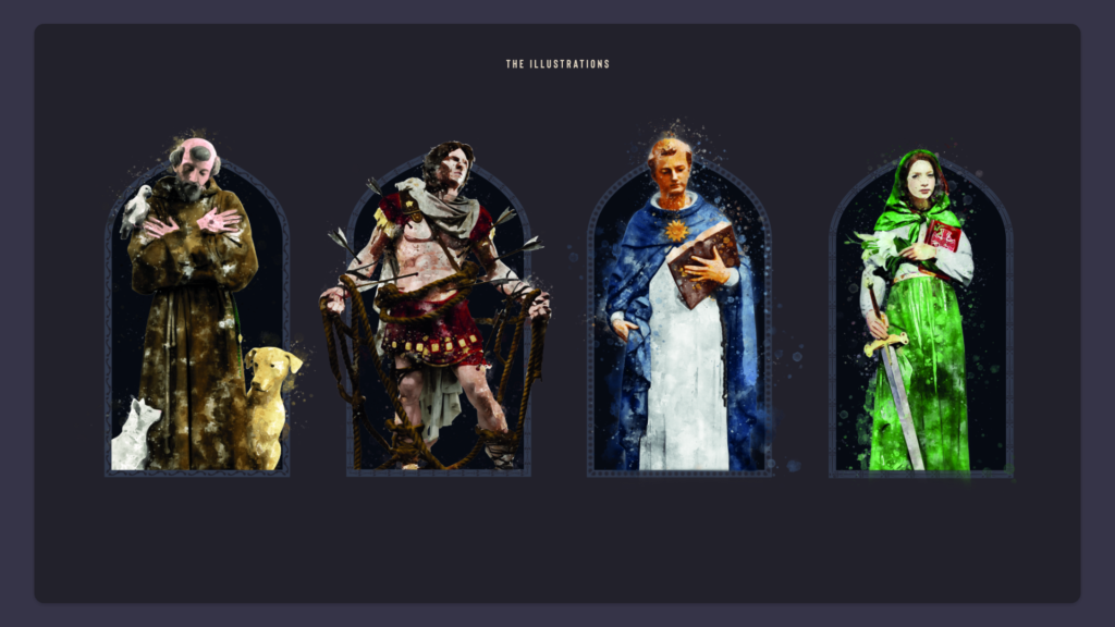
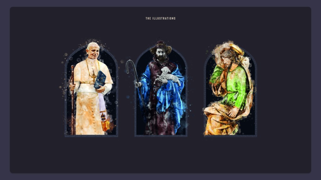
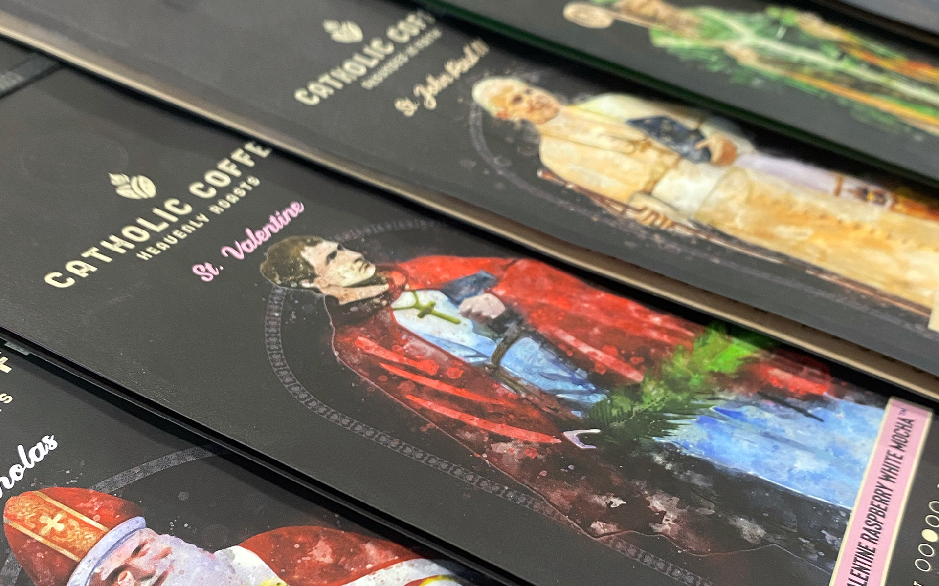
The vision for Catholic Coffee was to build a brand that celebrated the stories of extraordinary saints while delivering a product people would proudly brew, display, and share.
The challenge was finding the balance between reverence and craftsmanship. The brand needed to resonate with practicing Catholics without feeling overly commercial, while also presenting itself as a premium coffee experience worthy of the product inside.
The Approach
Every element of the brand was designed to reinforce authenticity.
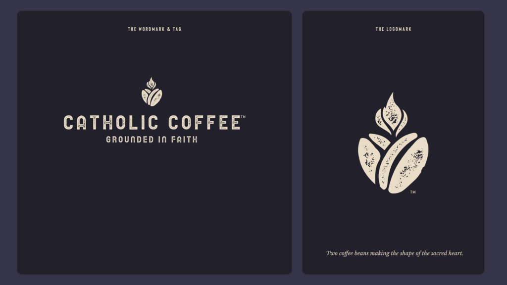
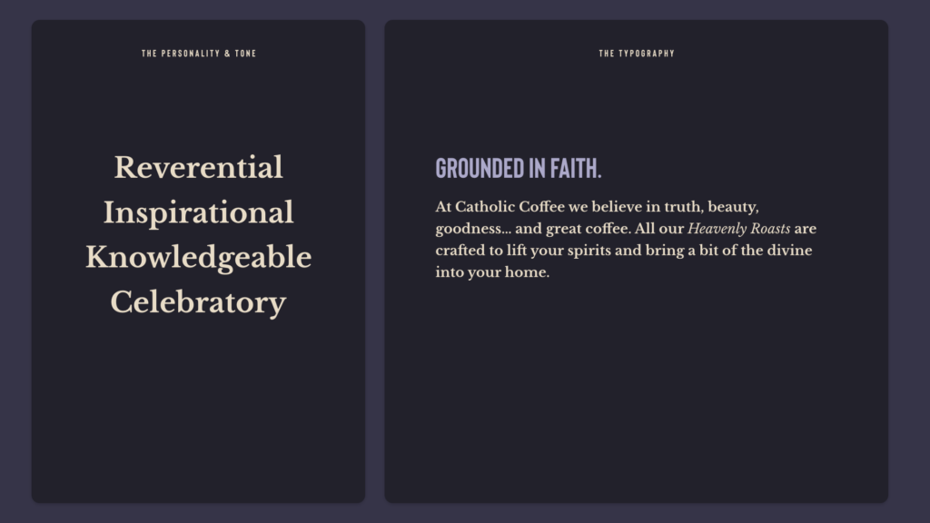
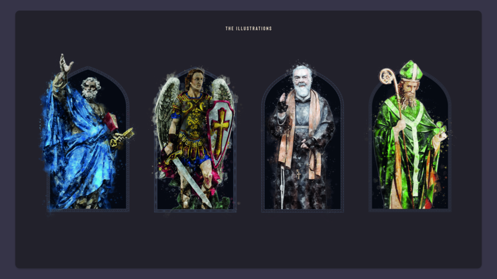
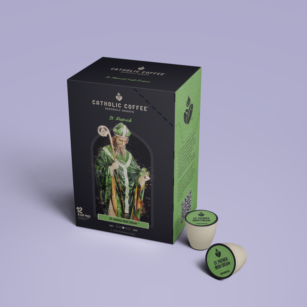
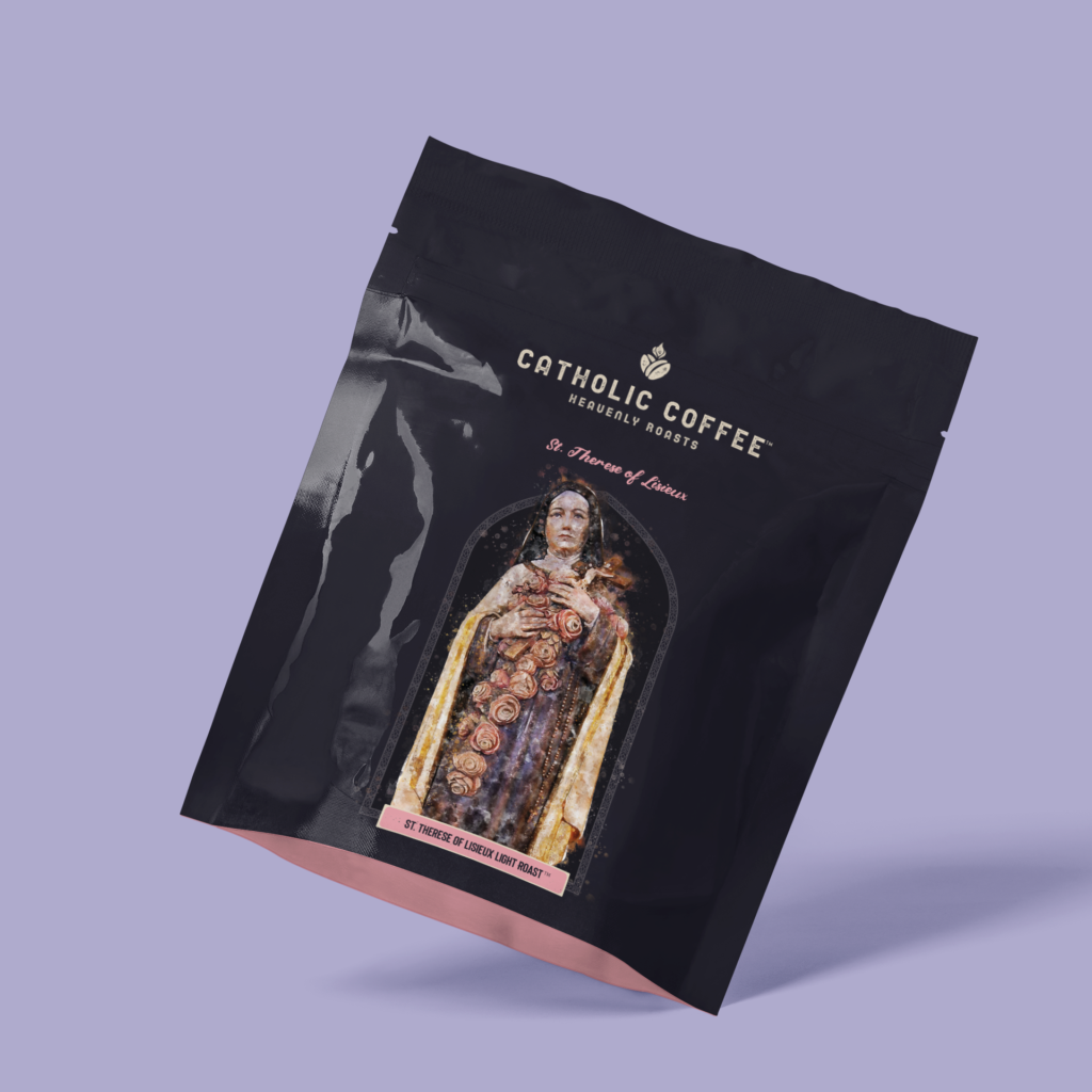
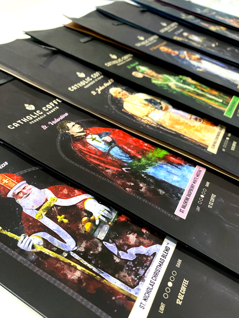
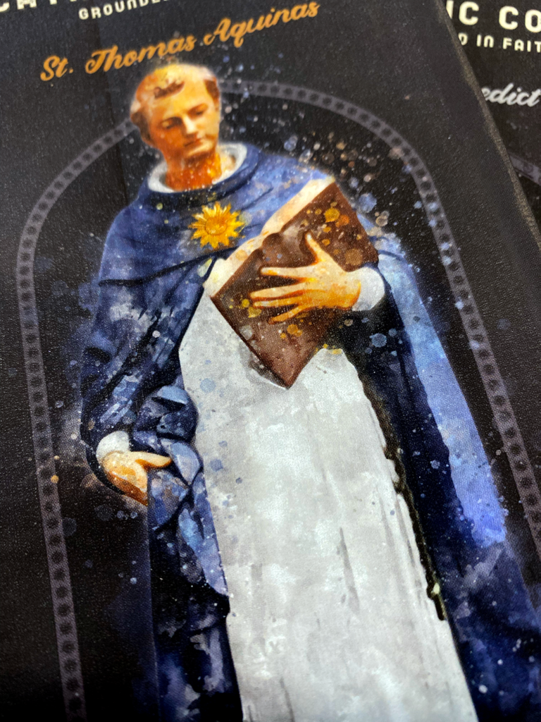
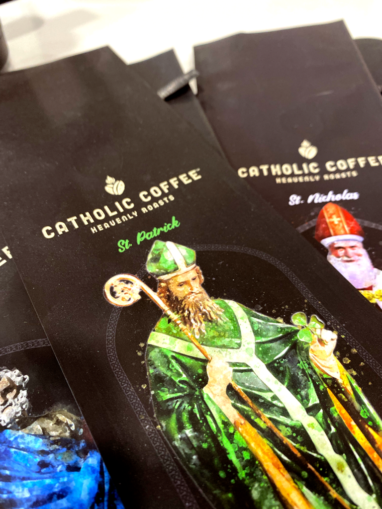
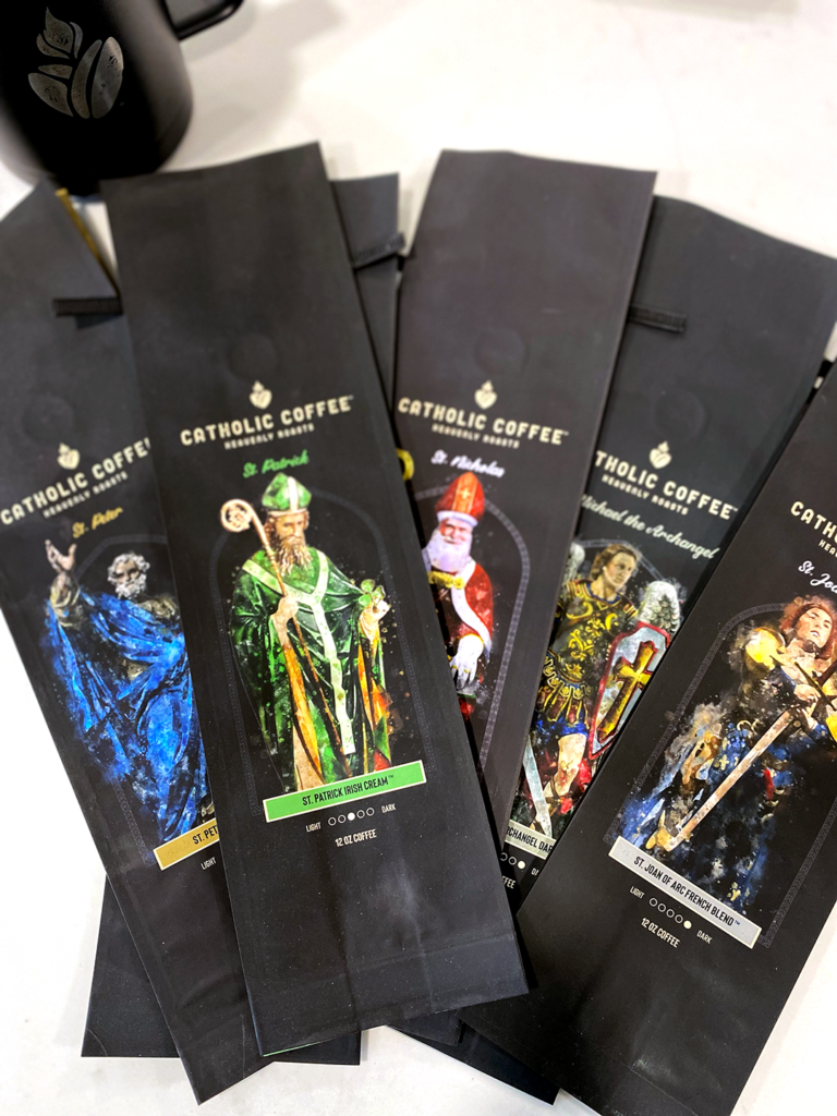
The visual identity drew inspiration from Catholic art, symbolism, and centuries of design tradition, while remaining approachable enough for a modern audience. Each coffee became an opportunity to tell the story of a different saint, giving every product its own personality while remaining part of a cohesive brand family.
The goal wasn’t simply beautiful packaging.
It was creating a product that felt meaningful before it was ever opened.
The Solution
From concept to cup, I helped shape the entire creative vision for Catholic Coffee.
I developed the brand identity, designed the packaging system, illustrated each featured saint, and established a visual language that could grow with future products and seasonal releases.
The result is a brand that combines thoughtful storytelling, handcrafted illustration, and premium product design into an experience that reflects both the quality of the coffee and the tradition that inspired it.
My Role
- Brand Strategy
- Brand Identity Design
- Creative Direction
- Packaging Design
- Product Design
- Original Illustration
- Visual Storytelling
- Art Direction
What Made the Difference
The strongest brands don’t just identify products.
They give people something to connect with.
By combining authentic storytelling with a premium visual identity, Catholic Coffee became more than a package on a shelf. It became a conversation about faith, craftsmanship, and the remarkable lives of the saints who inspired each roast.
Field Notes
People can recognize authenticity.
Especially when it comes to something deeply personal like faith.
The goal wasn’t to decorate coffee with religious imagery. It was to build a brand that felt like it belonged within the tradition it celebrated.
-
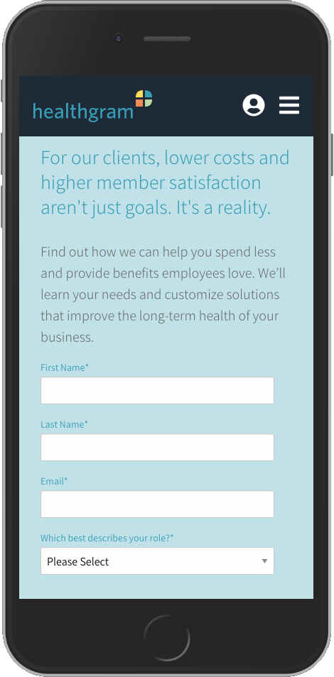
 Healthgram
Healthgram
The Challenge
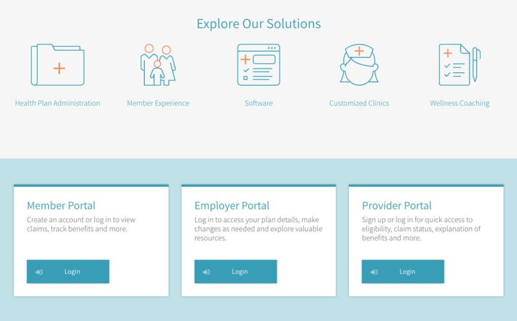
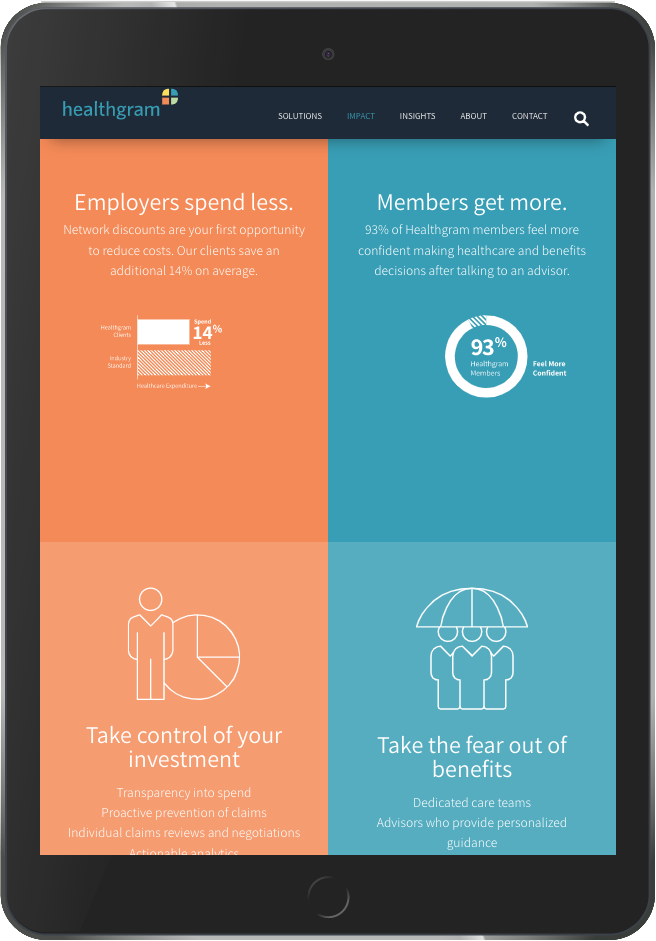
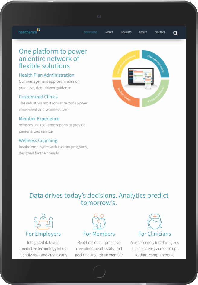
Benefits leaders weren’t looking for another vendor. They needed confidence that Healthgram could simplify one of the most complicated parts of their business.
Healthcare and employee benefits are filled with unfamiliar terminology, complex processes, and competing providers. That complexity often makes it difficult for prospective clients to quickly understand what makes one organization different from another.
Healthgram needed a website that communicated expertise without adding to the confusion.
The challenge wasn’t creating more content. It was making complicated ideas feel approachable, understandable, and actionable.
The Approach
Clarity became the design strategy.
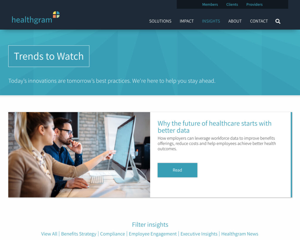
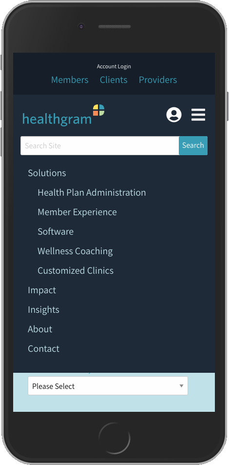
The user experience was built around simplifying navigation, organizing information into digestible sections, and guiding visitors naturally toward the questions they were already asking.
Content was rewritten to reduce industry jargon, visual hierarchy helped reinforce key messages, and multiple opportunities to connect with the Healthgram team were thoughtfully integrated throughout the experience.
The objective wasn’t simply to explain Healthgram’s services.
It was to help visitors understand why those services mattered.
The Solution
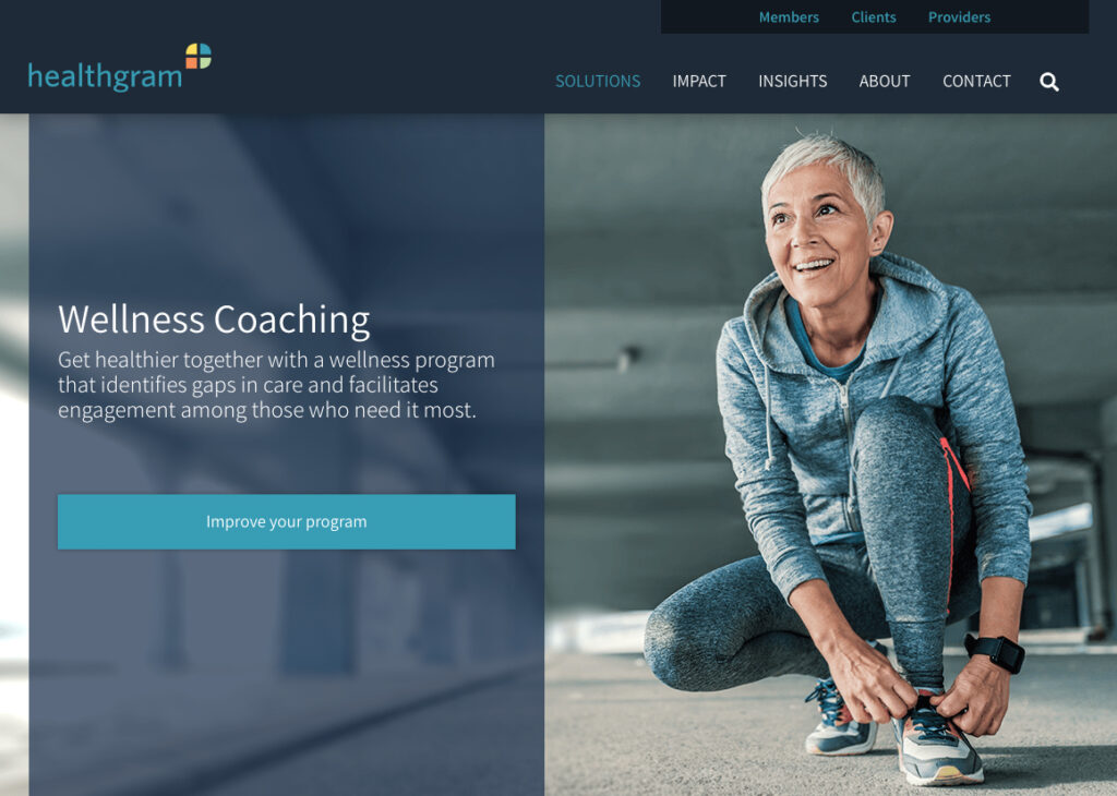
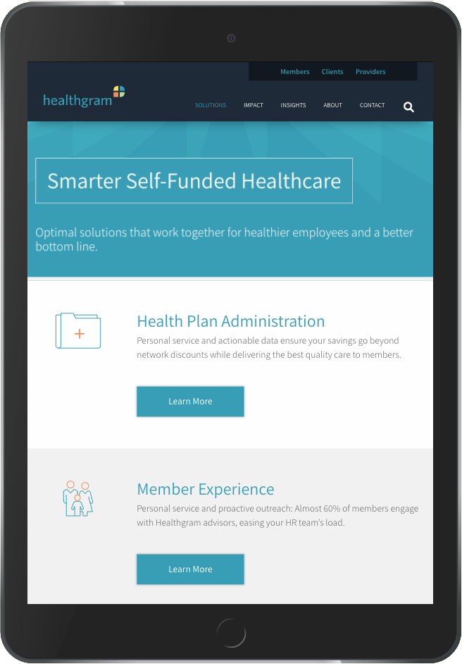
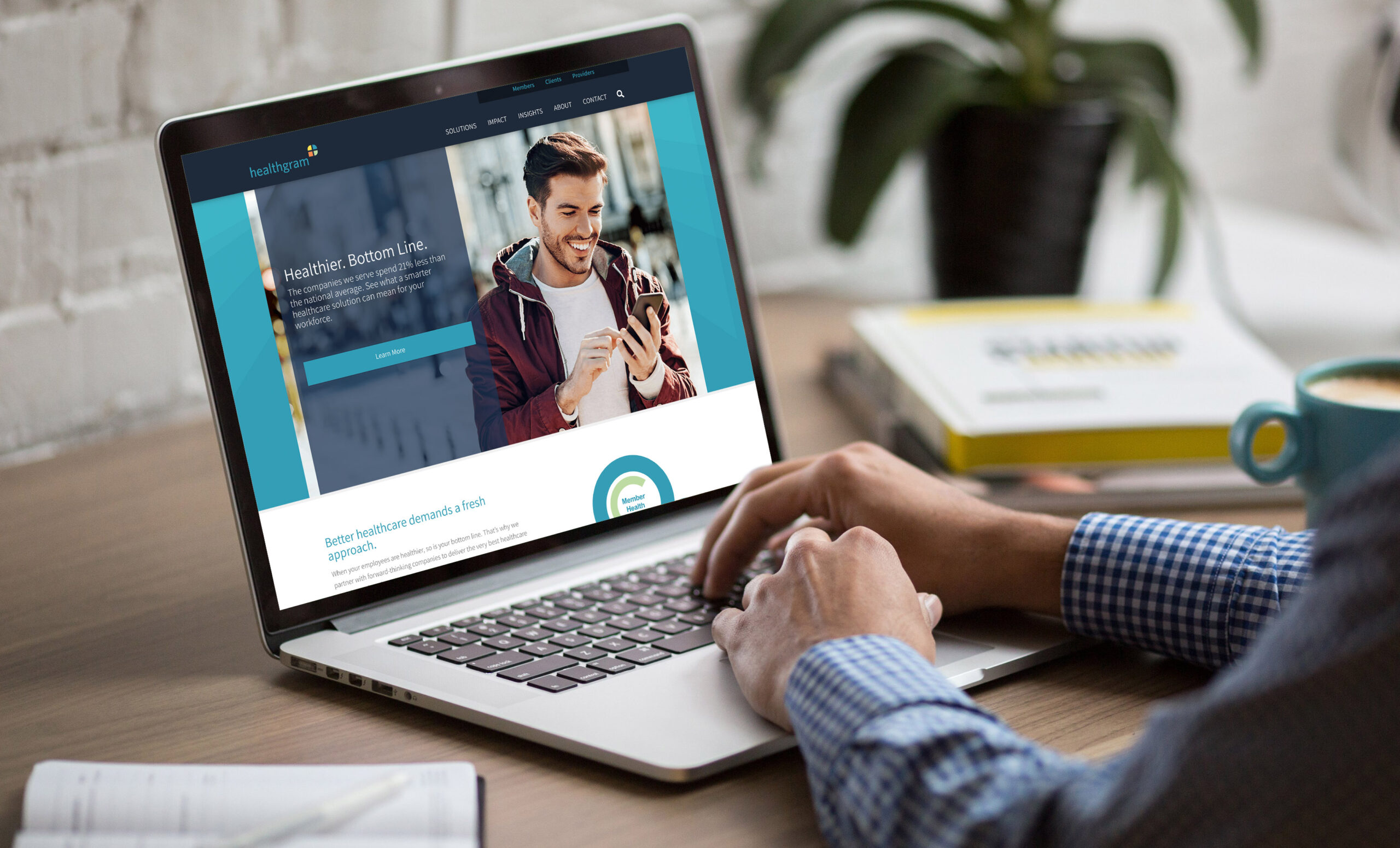
I led the creative direction, user experience, design, and development of a custom WordPress website that transformed a complex subject into an intuitive digital experience.
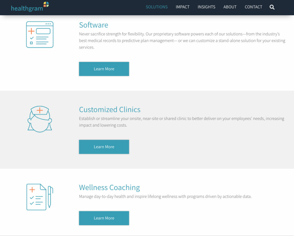
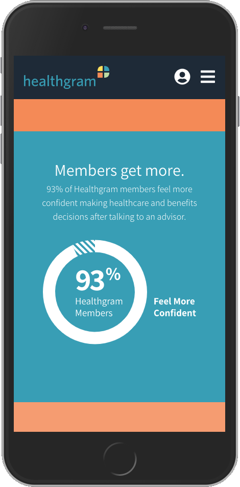
The responsive website combined clear messaging, thoughtful information architecture, and streamlined navigation to help employers and benefits professionals quickly understand Healthgram’s approach while encouraging meaningful engagement with the team.
Behind the scenes, the flexible content management system made it easy for internal teams to maintain and expand the website as the business evolved.
My Role
- Digital Creative Direction
- UX Strategy
- Information Architecture
- Website Design
- WordPress Development
- Content Strategy
- Copy Guidance
- Responsive Design
What Made the Difference
The website didn’t try to impress visitors with complexity.
It built confidence through clarity.
Every page was designed to reduce friction, answer questions quickly, and help prospective clients understand the value of Healthgram’s services without feeling overwhelmed.
Field Notes
Expertise doesn’t have to sound complicated.
In fact, the organizations that know their business best are often the ones that explain it most clearly.
Good design doesn’t simplify the work. It simplifies the understanding.
-
 Visit NC
Visit NC
The Challenge
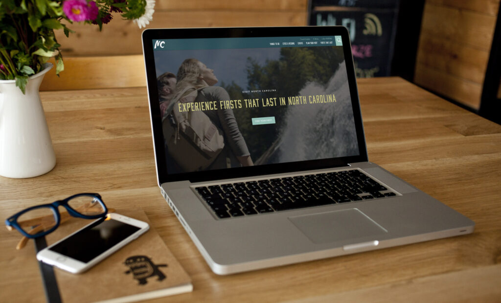
Planning a trip begins with confidence. Travelers needed to believe Visit North Carolina could help them discover the right experiences without feeling overwhelmed by thousands of destinations, events, and travel resources.
Visit North Carolina isn’t simply a tourism website.
It’s one of the state’s most valuable marketing tools, serving thousands of pages of destinations, attractions, events, itineraries, and travel inspiration to visitors from around the world.
The challenge was creating an experience that could organize an enormous amount of content while remaining intuitive, engaging, and inspiring across every device.
Good navigation wasn’t enough. People needed to enjoy discovering what North Carolina had to offer.
The Approach
Travel planning should feel exciting—not overwhelming.
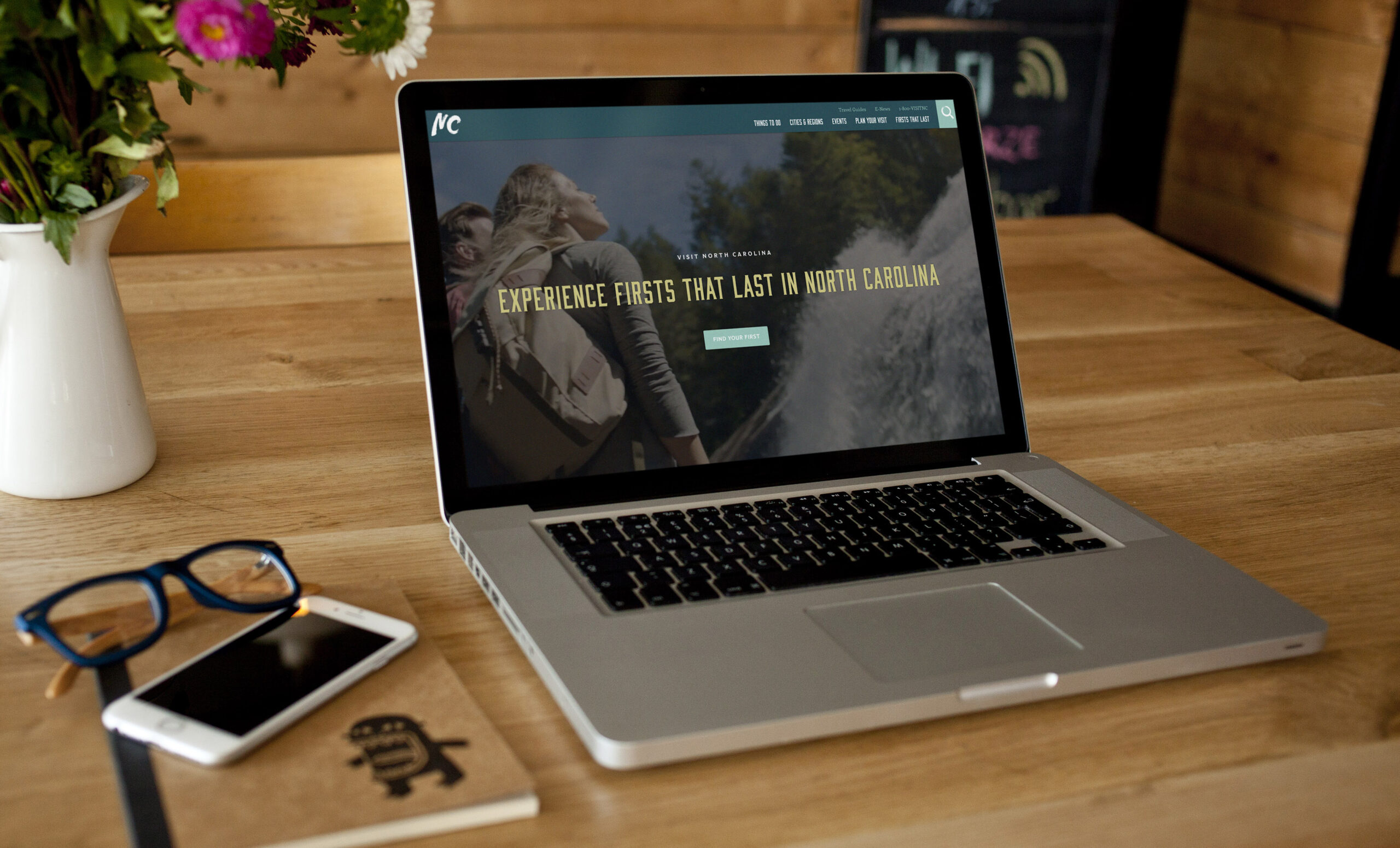
I focused on creating user experiences that balanced inspiration with usability, allowing visitors to browse naturally while always feeling oriented. Strong information architecture, thoughtful visual hierarchy, and responsive design helped transform a massive content ecosystem into an experience that felt approachable and enjoyable.
Behind every page was the same objective: help people spend less time searching and more time imagining their next trip.
The Solution
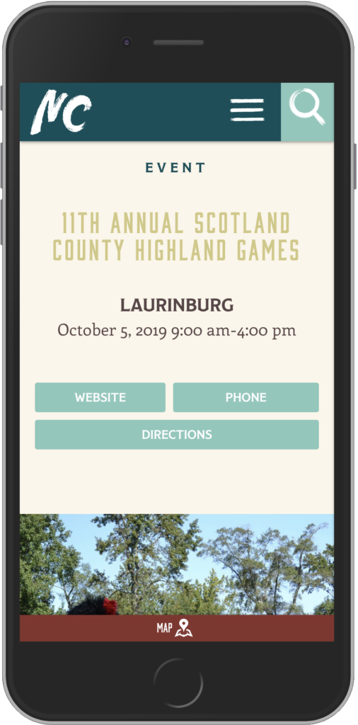
As part of the creative team behind Visit North Carolina’s digital presence, I helped shape the user experience, visual design, and ongoing evolution of a website containing more than 10,000 pages of travel content.
The platform serves as both an inspirational travel guide and a practical planning resource, helping visitors discover destinations, events, restaurants, lodging, and experiences across the state.
Visit North Carolina is one of only fifty official state tourism websites in the United States. Having the opportunity to help shape the digital experience for a destination at that scale was both professionally rewarding and creatively challenging.
My Role
- Digital Creative Direction
- UX Strategy
- Information Architecture
- Responsive Website Design
- User Interface Design
- Creative Collaboration
- Ongoing Product Evolution
What Made the Difference
The scale of the website wasn’t the accomplishment.
Making more than 10,000 pages feel approachable was.
By combining thoughtful user experience with editorial storytelling and intuitive navigation, the platform helped visitors focus less on finding information and more on planning memorable experiences.
Design Observation
More content doesn’t create a better experience.
Better organization does.
When information is structured around how people think instead of how organizations are organized, exploration becomes effortless.
-
 Wicked Cowboy
Wicked Cowboy
The Challenge
Wicked Cowboy had built early momentum, but the brand was ready for its next chapter.
Sales were encouraging, yet the identity lacked the clarity and consistency needed to compete in an increasingly crowded western lifestyle market. The visual language felt generic, the messaging wasn’t clearly defined, and the brand hadn’t fully articulated who it existed for—or why customers should choose it over countless alternatives.
The opportunity wasn’t just to refresh the logo.
It was to define the brand.
The Approach
Before touching the identity, we stepped back and asked bigger questions.
Who is the Wicked Cowboy customer?
What do they believe?
What kind of life are they trying to build?
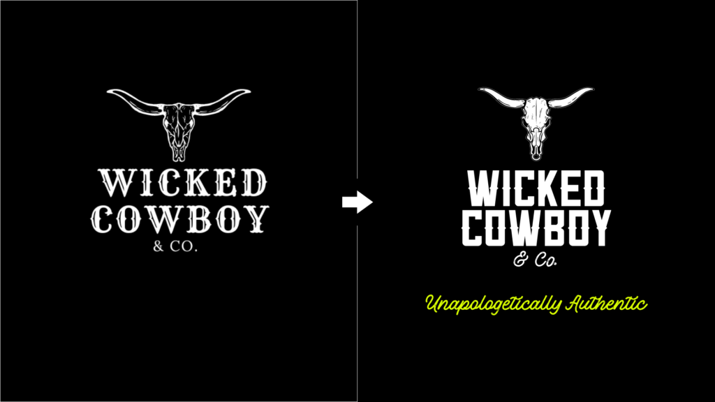
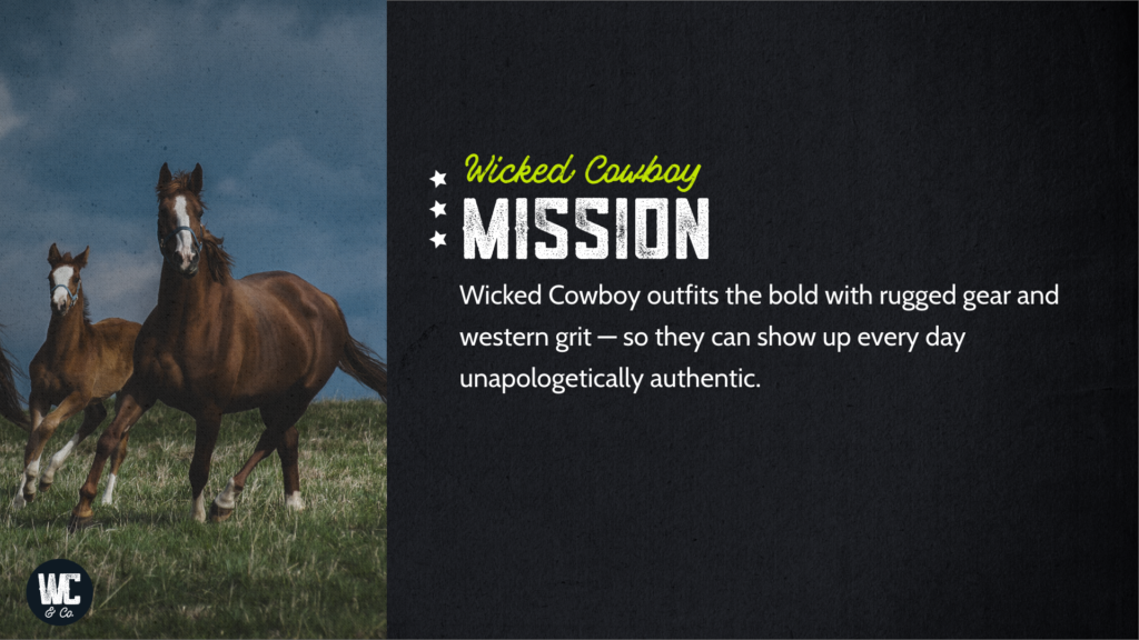
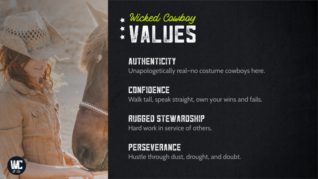
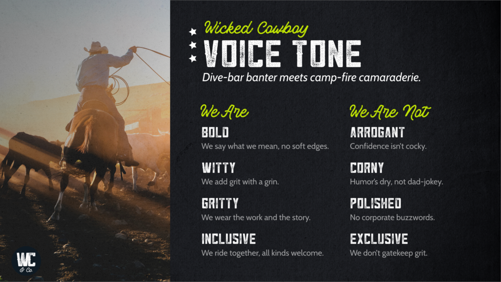
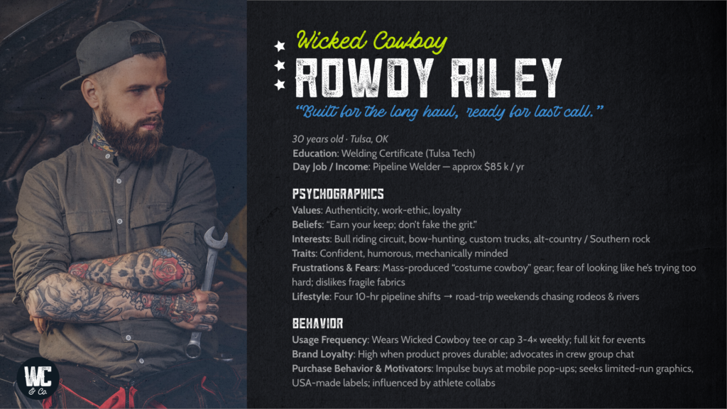
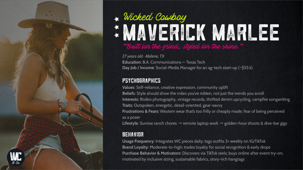
Those conversations became the foundation for a complete brand articulation, including audience personas, positioning, messaging, tone of voice, and a clear creative direction that could guide every future decision.
Out of that process came a simple idea that captured the heart of the brand:
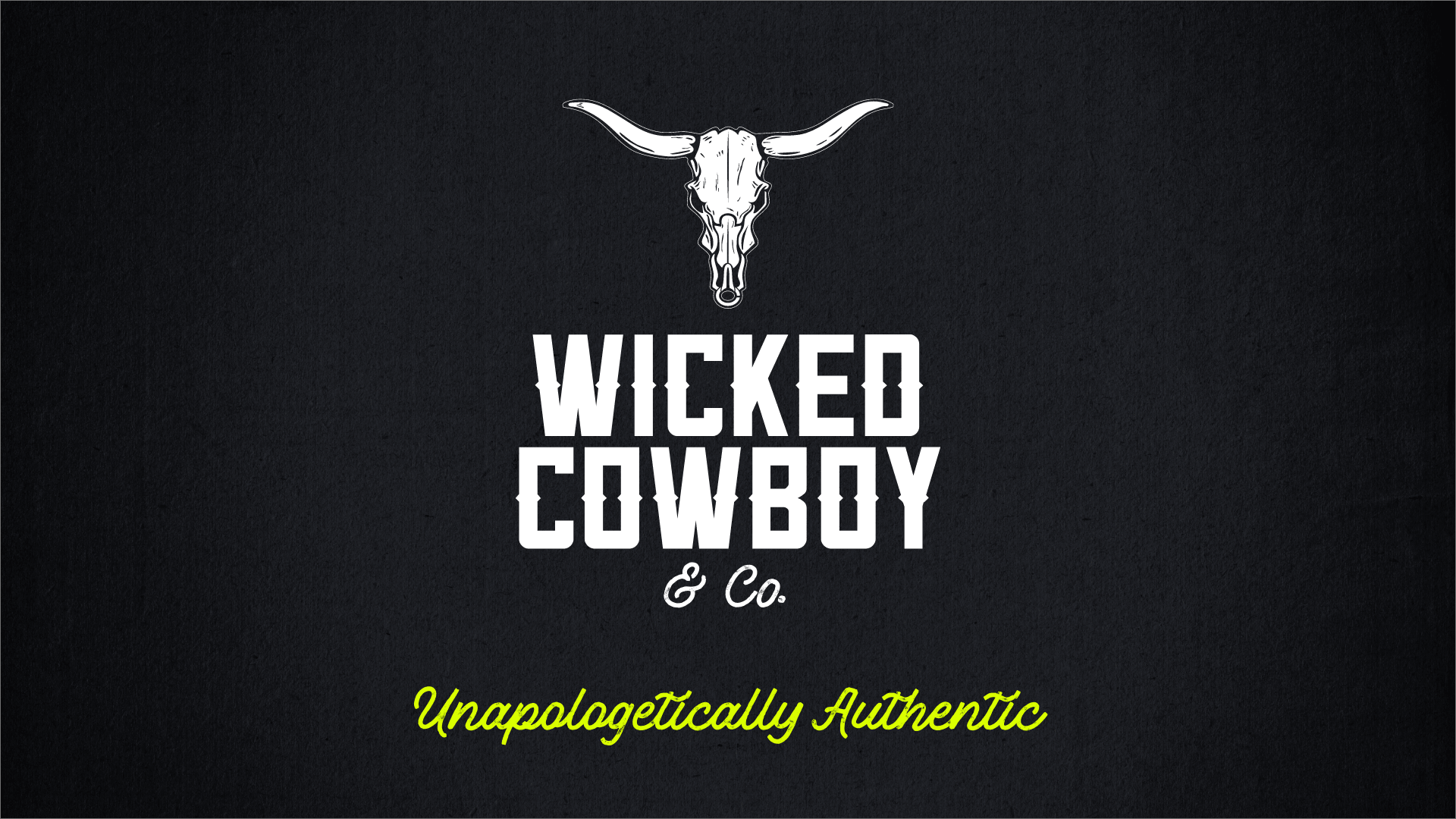
Unapologetically Authentic.
The Solution
I led the strategic repositioning and identity refresh for Wicked Cowboy, developing a brand platform that extended well beyond visual design.
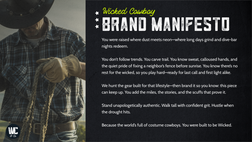
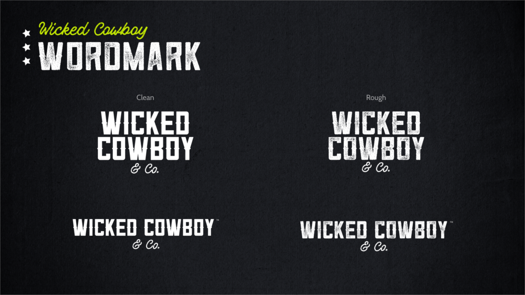
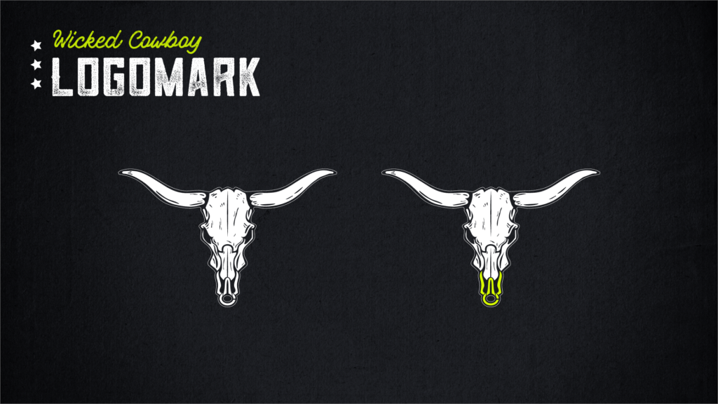
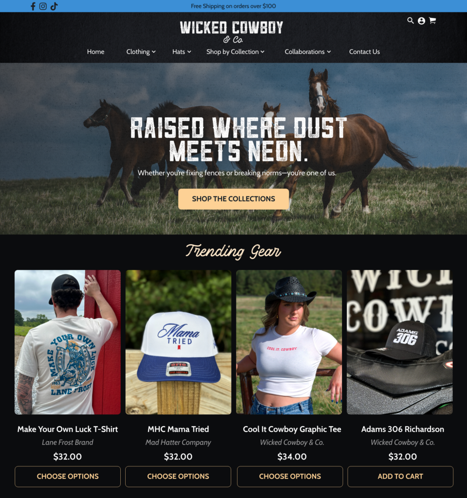
The work included refining the logo, evolving the visual identity, writing the brand manifesto, defining customer personas, establishing a messaging framework, and creating a cohesive brand voice that could influence everything from product selection and photography to marketing campaigns and future digital experiences.
Rather than simply giving the company a new look, the project provided a strategic foundation that helps every future creative decision feel intentional and aligned.
My Role
- Brand Strategy
- Brand Positioning
- Audience Research
- Customer Personas
- Messaging Framework
- Brand Manifesto
- Brand Identity Refresh
- Logo Refinement
- Copywriting
- Creative Direction
What Made the Difference
The biggest transformation wasn’t visual.
It was strategic.
By defining who the brand serves and what it stands for, Wicked Cowboy gained more than a refreshed identity. It gained a framework for future product development, marketing, and business decisions—one capable of growing alongside the company.
Field Notes
Strong brands don’t just influence what people buy.
They influence what a business chooses to create next.
When strategy is clear, design stops being decoration and starts becoming a filter for every future decision.
-
 Warrior Joe
Warrior Joe
The Challenge
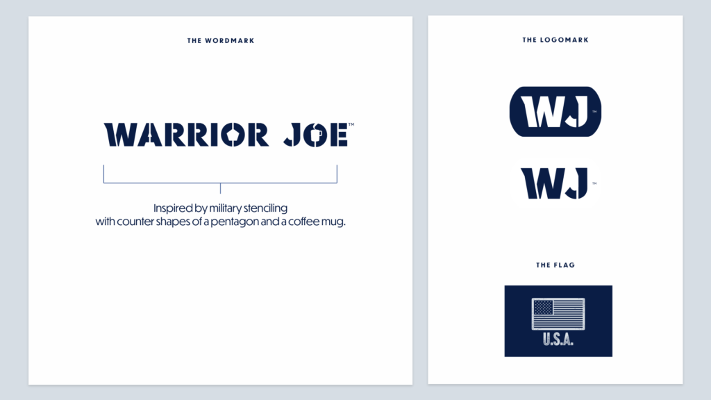
Patriotic branding is easy to imitate. Authenticity isn’t. Warrior Joe needed to honor the men and women who serve without feeling performative, commercial, or manufactured.
The vision for Warrior Joe extended far beyond creating another coffee brand.
It was about building a brand worthy of the people it was created to serve.
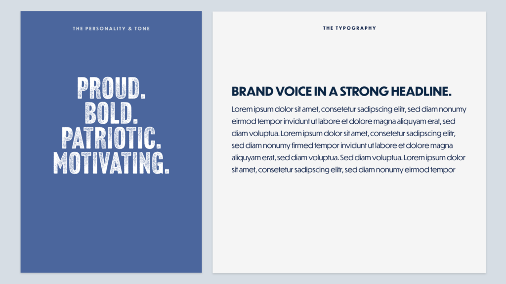
Every decision had to strike a careful balance—strong without becoming aggressive, patriotic without becoming political, and premium enough to compete in the specialty coffee market while remaining approachable to military families and supporters.
When your audience includes people who have dedicated their lives to service, authenticity isn’t a marketing strategy. It’s an expectation.
The Approach
The brand was built around respect.
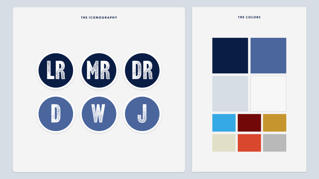
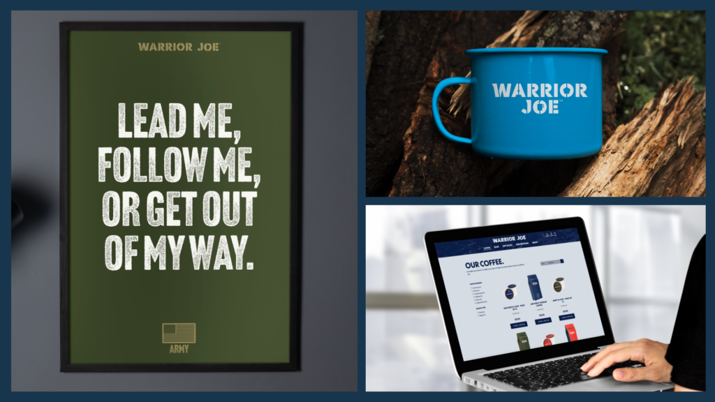
Rather than relying on clichés or exaggerated military imagery, I focused on creating an identity that reflected discipline, craftsmanship, and quiet confidence. The visual system was designed to feel timeless, allowing the coffee itself—and the people it honors—to remain the focus.
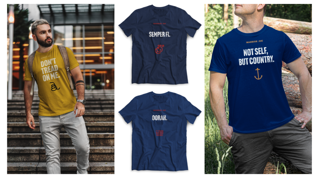
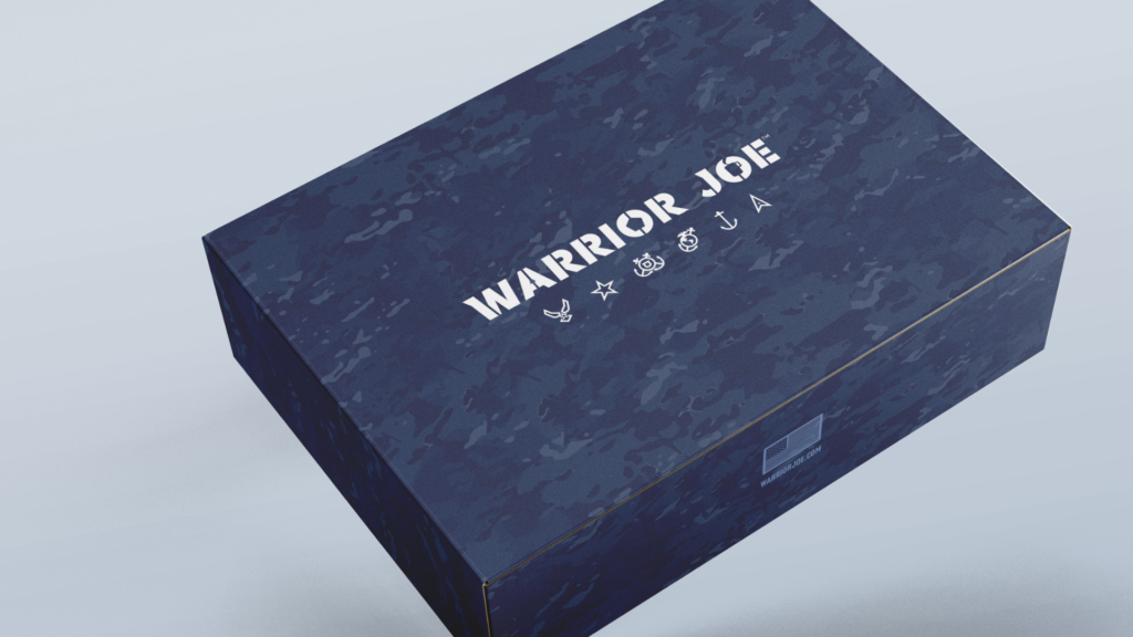
Every touchpoint, from the logo and packaging to the website and product presentation, was designed to tell a consistent story about service, sacrifice, and quality.
The Solution
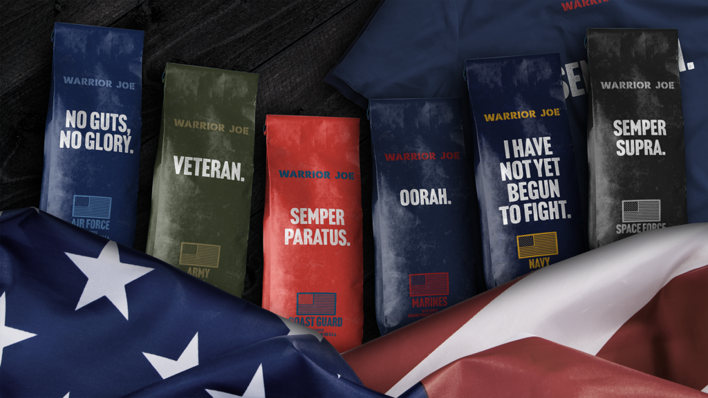
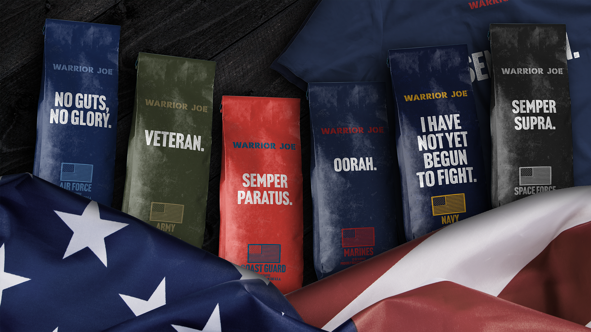
I led the creative vision for Warrior Joe, developing the brand identity, product packaging, and digital presence from the ground up.
The result is a cohesive brand system that communicates premium quality while honoring the values that inspired it. From the first impression on the shelf to the online shopping experience, every interaction reinforces the same message: this is a brand built with purpose.
By creating a flexible identity system, the brand is positioned to grow through new products, seasonal offerings, and future marketing initiatives without losing the character that defines it.
My Role
- Brand Strategy
- Brand Identity Design
- Creative Direction
- Product Design
- Packaging Design
- Website Design
- E-commerce Creative
- Art Direction
What Made the Difference
The strongest product brands don’t simply communicate what they sell.
They communicate what they believe.
Every element of Warrior Joe was designed to reinforce the same values—service, integrity, and craftsmanship—creating a brand experience that feels genuine from the package on the shelf to the final cup.
Field Notes
People can tell when a brand is borrowing someone else’s story.
The most meaningful brands don’t manufacture authenticity—they reveal it.
Good design isn’t about making a brand look patriotic. It’s about making it feel worthy of the people it’s meant to represent.