Mantle Senior Living
Creative Director • Web Designer • UX Lead • Web Developer • Logo DesignerThe Challenge
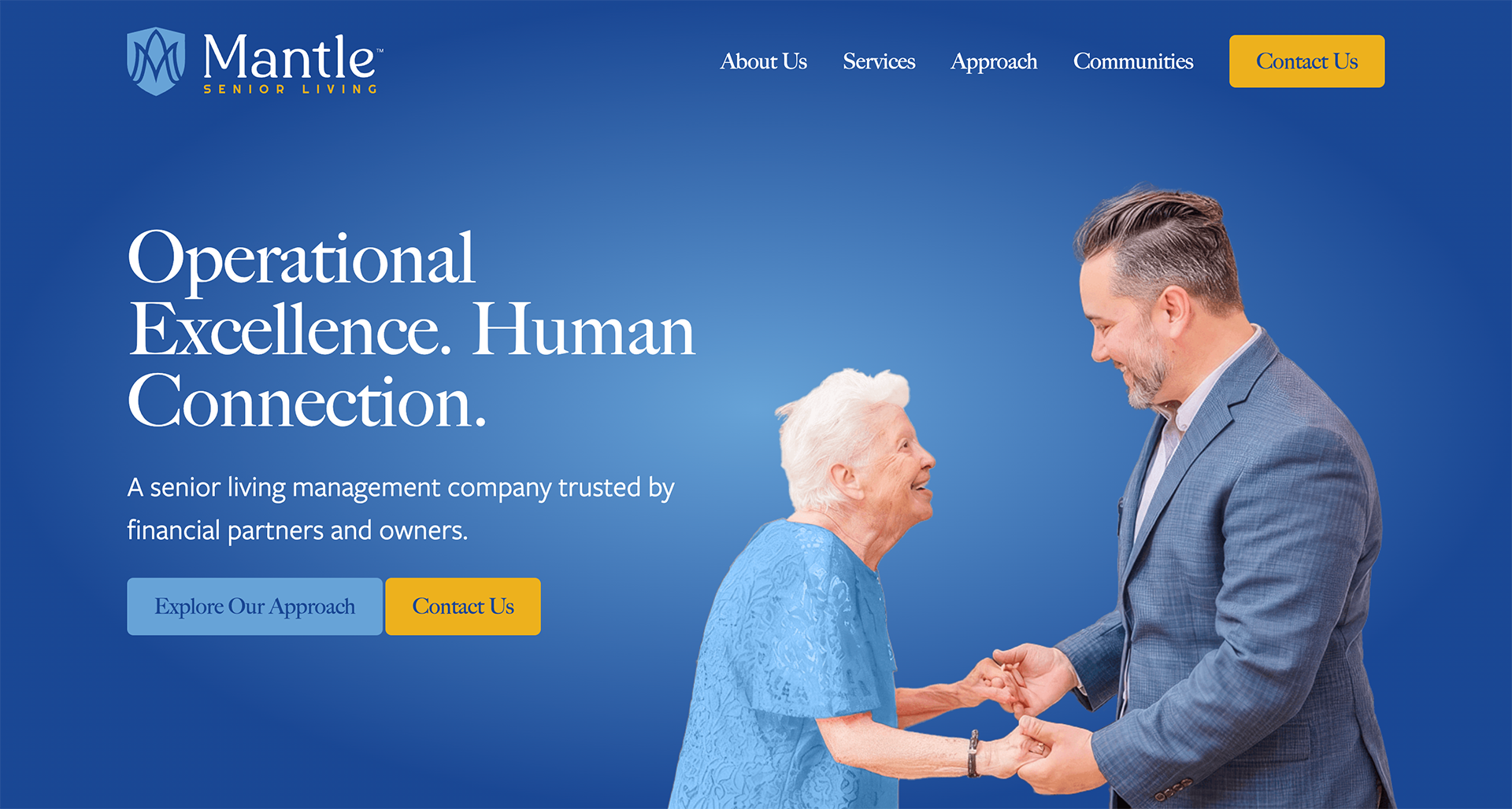
Mantle Senior Living was entering a new chapter. The company had evolved, but its brand and website no longer reflected the quality of care, professionalism, and long-term vision behind the organization.
The challenge wasn’t simply creating a more modern website. It was building confidence with multiple audiences at once. Adult children needed reassurance that their loved ones would receive exceptional care. Seniors needed a welcoming first impression. Investors needed to see an organization capable of thoughtful growth.
Those are emotional decisions, and trust becomes the deciding factor.
The Approach
Senior living is often presented as a list of services, amenities, and floor plans.
I wanted Mantle to feel different.
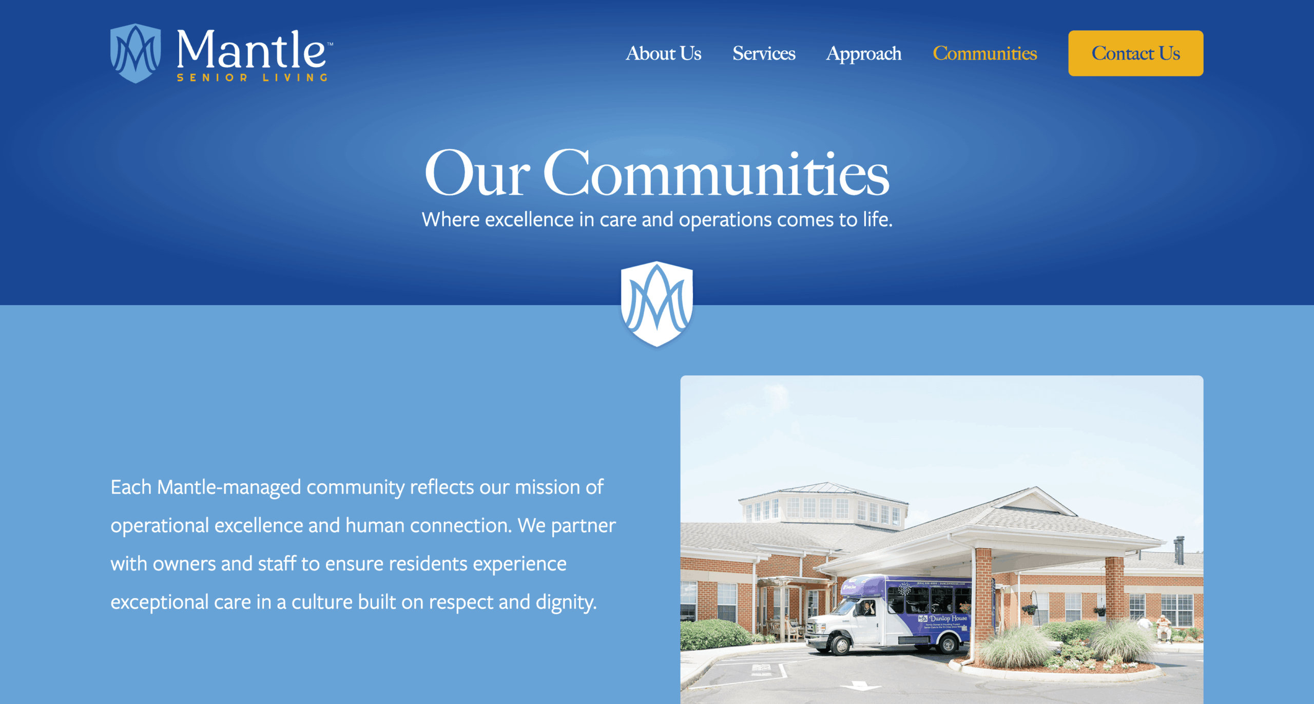
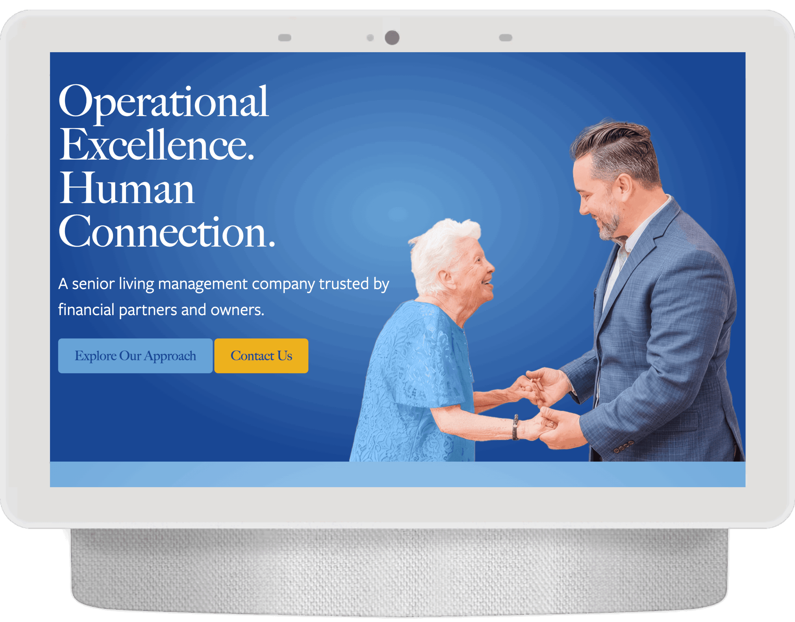
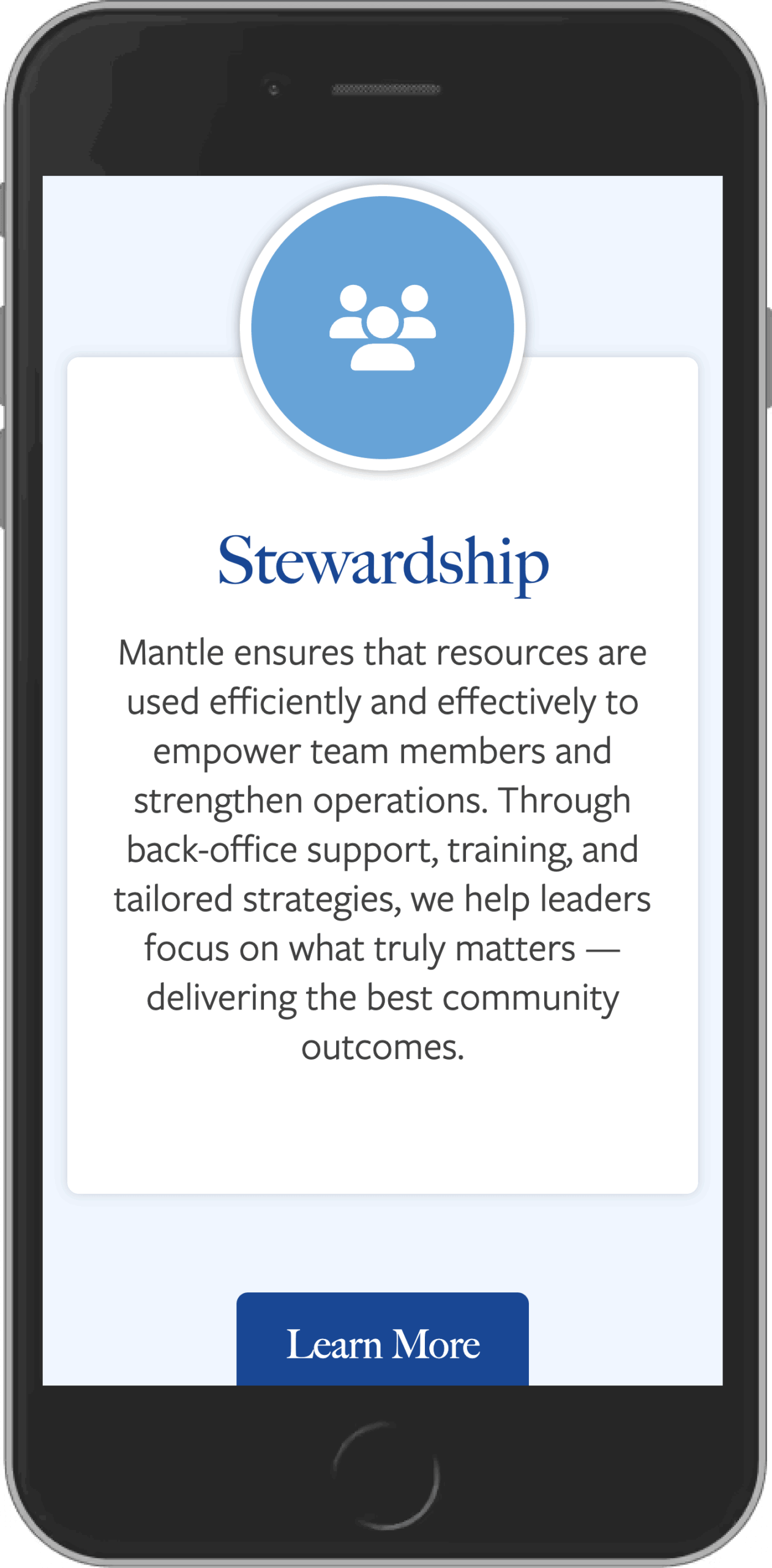
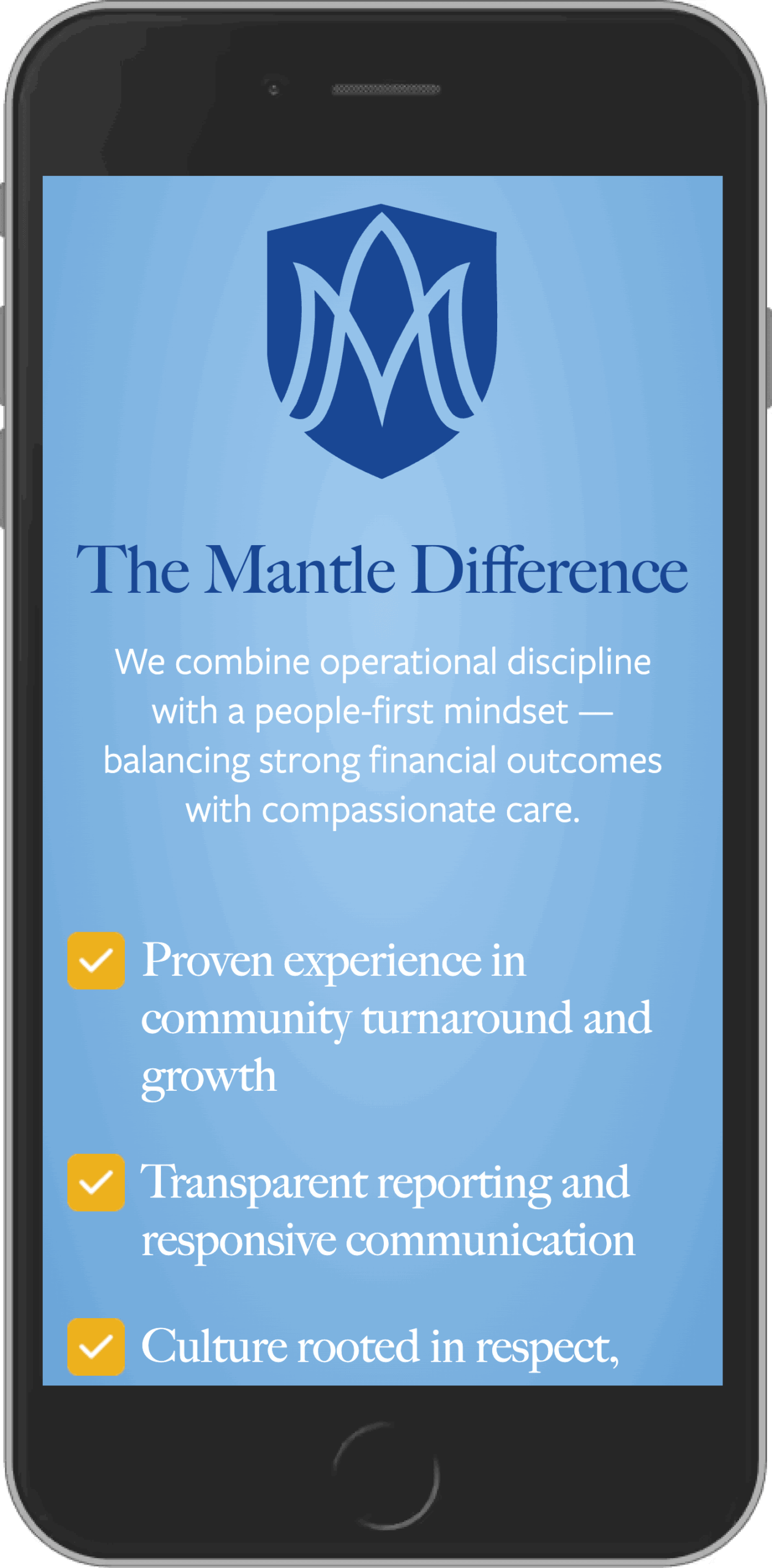
The strategy centered on creating warmth without sacrificing professionalism. We refined the brand, modernized the visual identity, simplified the user experience, and developed messaging that felt compassionate, confident, and easy to understand.
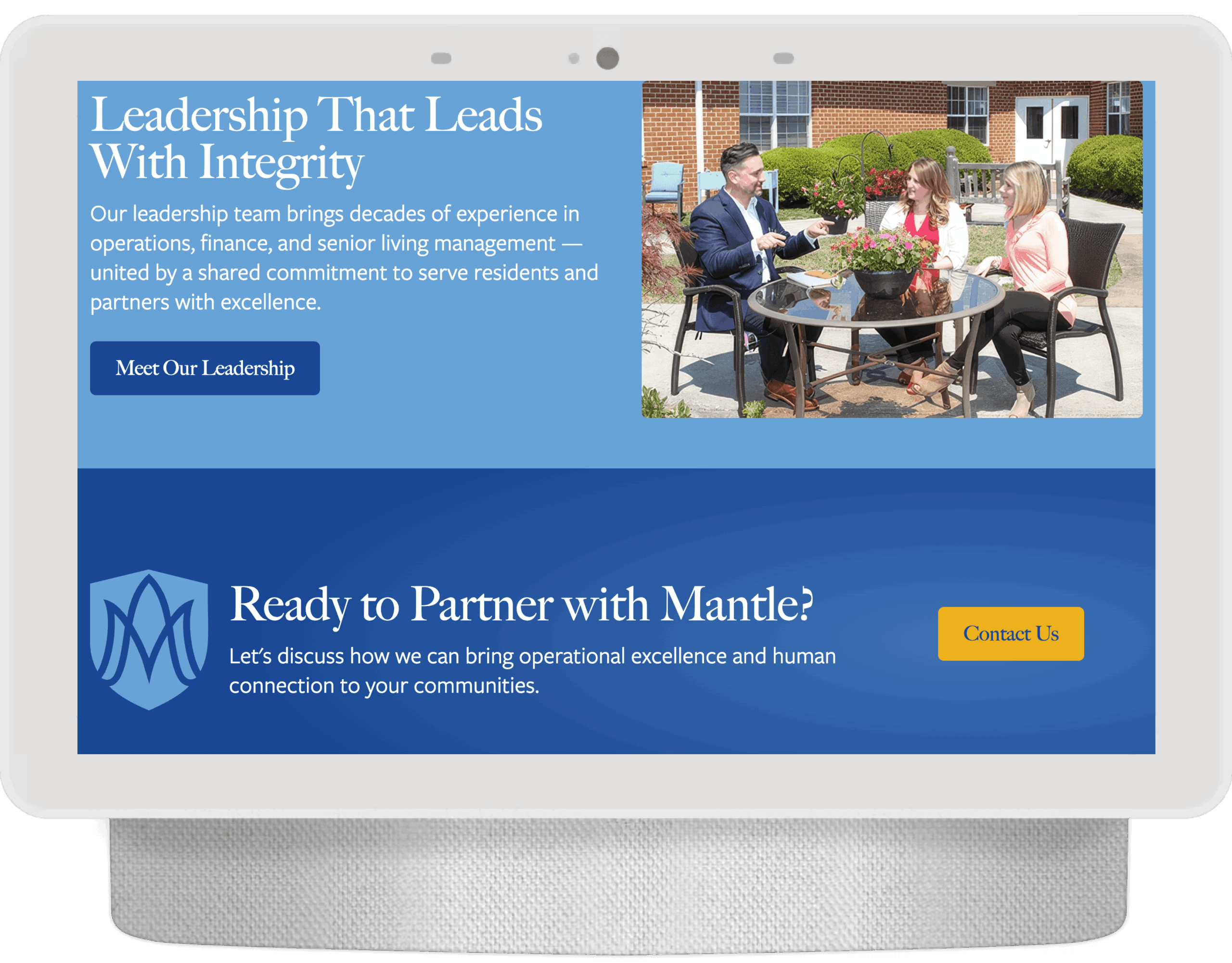
Rather than overwhelming visitors with information, the website guides them through a journey that answers the questions people are already asking: Who is this company? Can I trust them? Is this the right place for my family?
The Solution
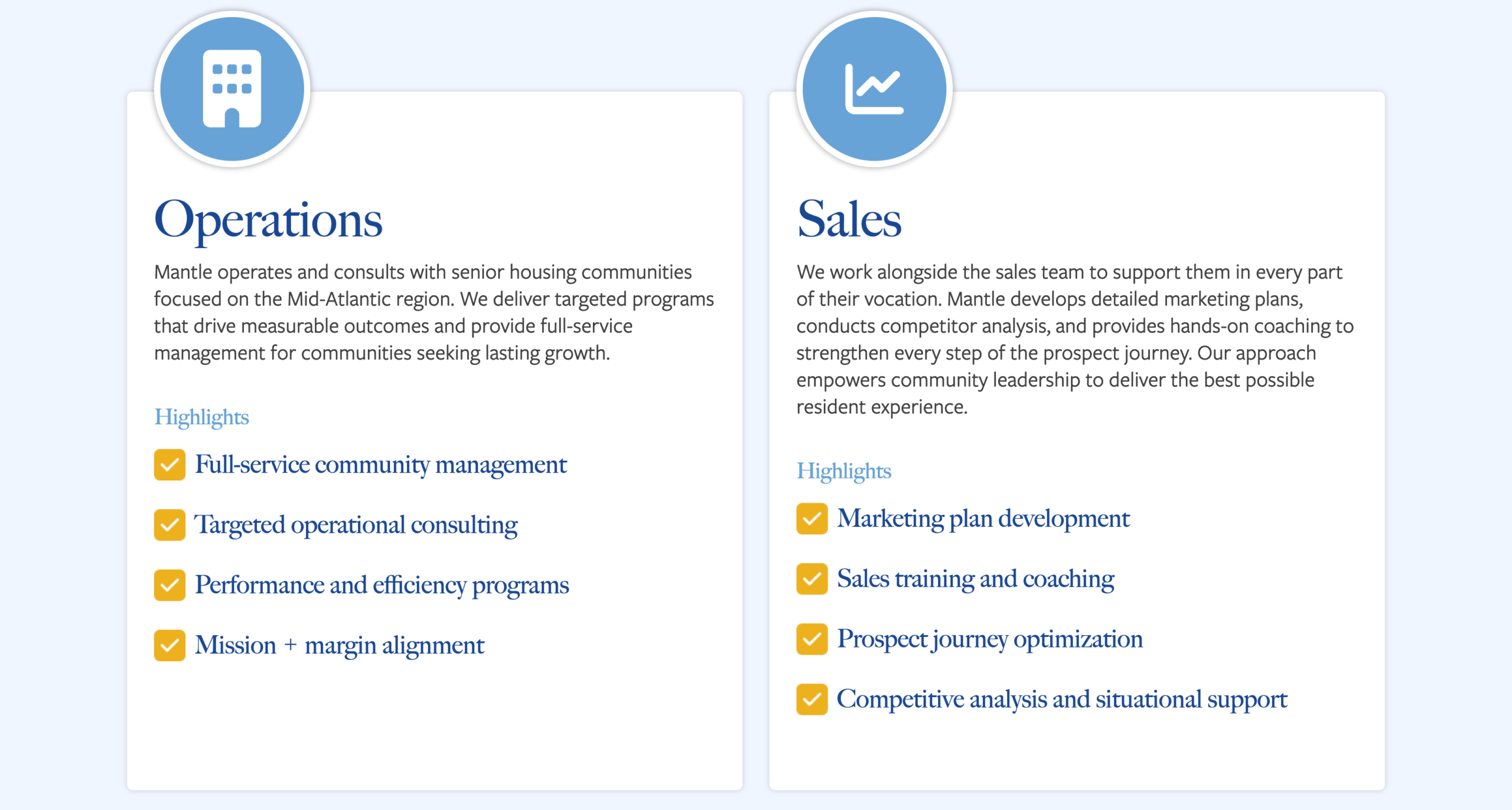
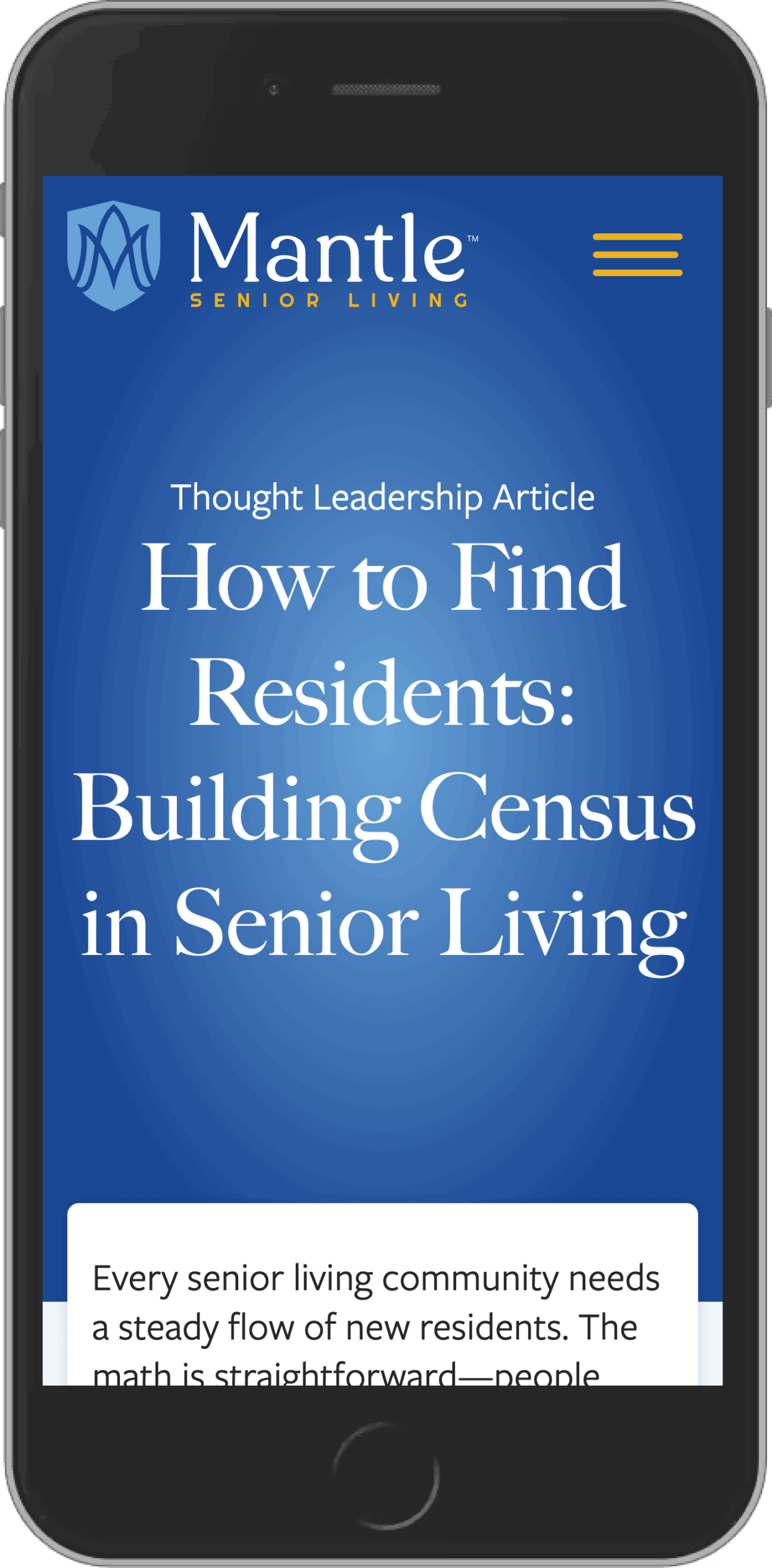
I led a comprehensive brand and website transformation that included a refreshed visual identity, a custom WordPress website, improved information architecture, and a complete content strategy.
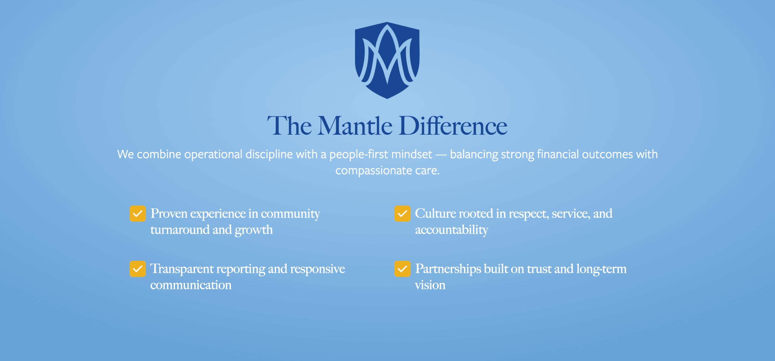
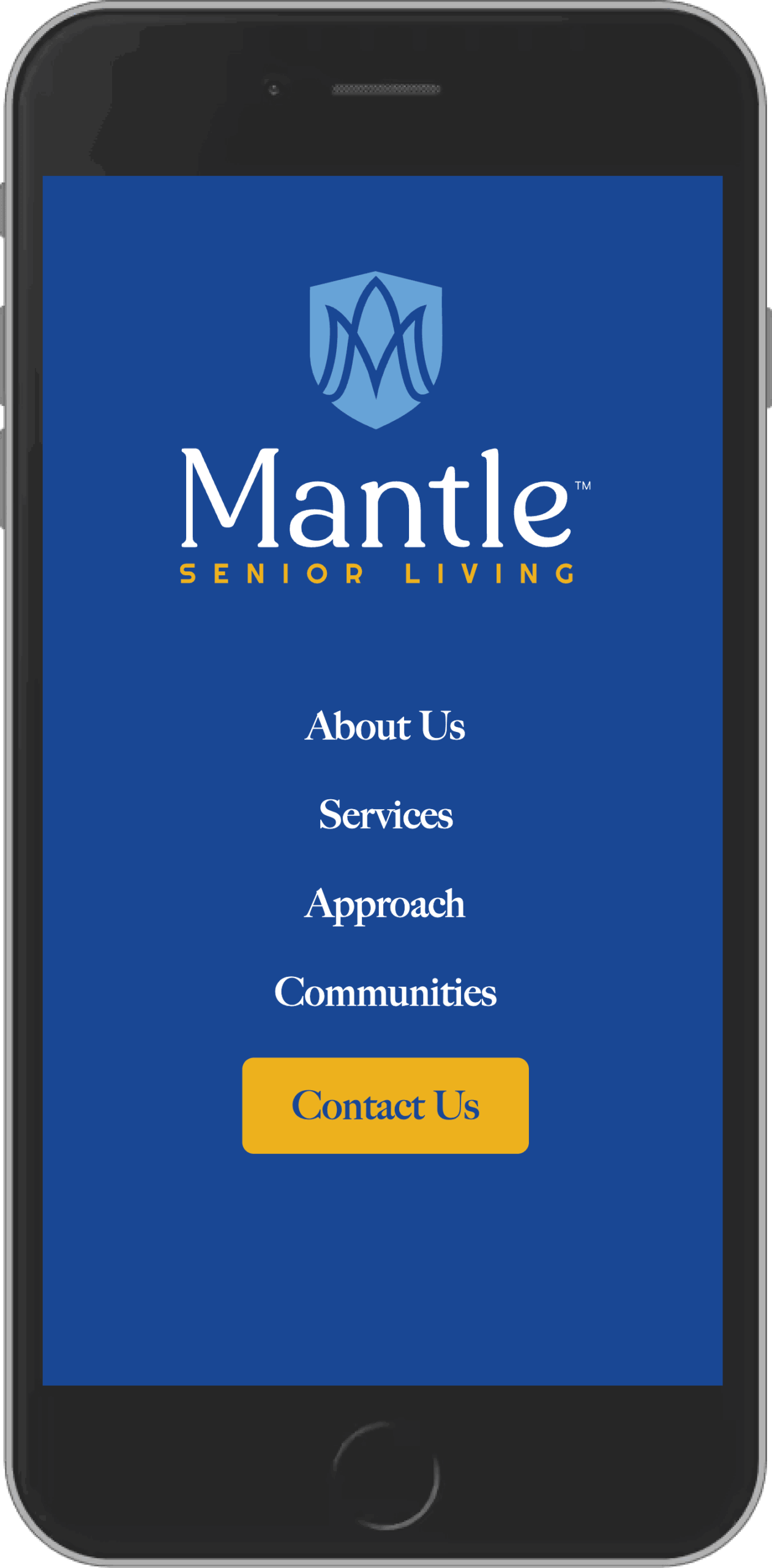
The updated brand introduced a refined logo, an evolved color palette, and a more approachable visual language that reflects the warmth of the Mantle communities while maintaining the professionalism expected by families, operators, and investors.
Behind the scenes, the site was built with a flexible content management system that allows the Mantle team to manage community information, expand as the organization grows, and keep content current without relying on a developer.
My Role
- Brand Strategy
- Brand Identity Refresh
- Logo Design
- UX Strategy
- Information Architecture
- Website Design
- WordPress Development
- Front-end Development
- Content Strategy & Copywriting
- Creative Direction
- Ongoing Website Support
What Made the Difference
The strongest part of this project wasn’t the new logo or the redesigned website.
It was creating clarity around a complicated and emotional decision.
Every design choice, every page, and every piece of copy was built to reduce uncertainty and help visitors feel more confident in the organization behind the brand.
That’s what trust looks like in practice.
Field Notes
Design alone doesn’t convince someone to trust a senior living provider.
Clarity does.
When families can quickly understand who you are, what you value, and how you’ll care for the people they love, good design becomes almost invisible. It simply makes confidence easier to find.
https://mantleseniorliving.com/