Visit NC
Digital Creative Director • Digital Designer • UX LeadThe Challenge
Planning a trip begins with confidence. Travelers needed to believe Visit North Carolina could help them discover the right experiences without feeling overwhelmed by thousands of destinations, events, and travel resources.
Visit North Carolina isn’t simply a tourism website.
It’s one of the state’s most valuable marketing tools, serving thousands of pages of destinations, attractions, events, itineraries, and travel inspiration to visitors from around the world.
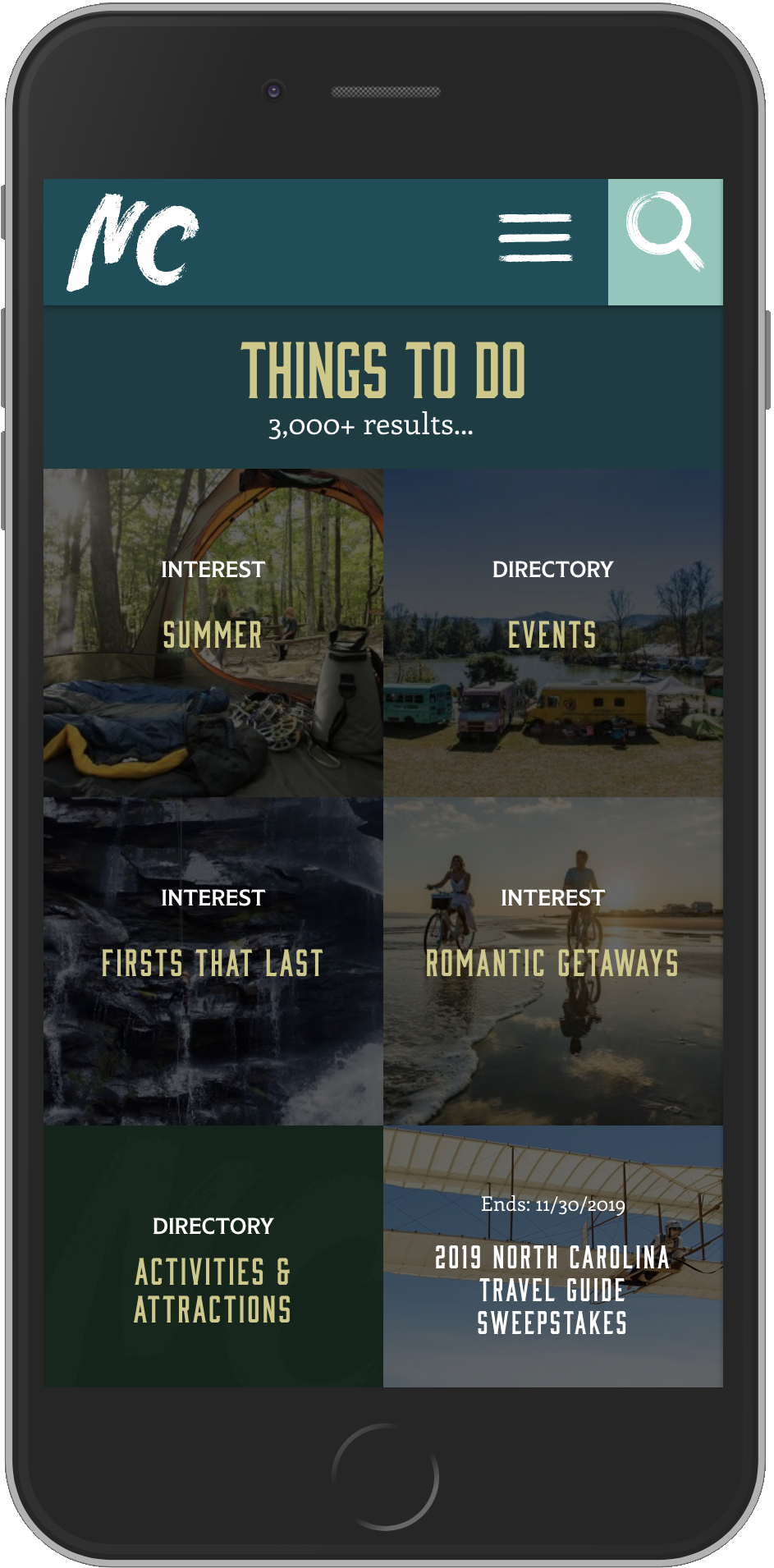
The challenge was creating an experience that could organize an enormous amount of content while remaining intuitive, engaging, and inspiring across every device.
Good navigation wasn’t enough. People needed to enjoy discovering what North Carolina had to offer.
The Approach
Travel planning should feel exciting—not overwhelming.
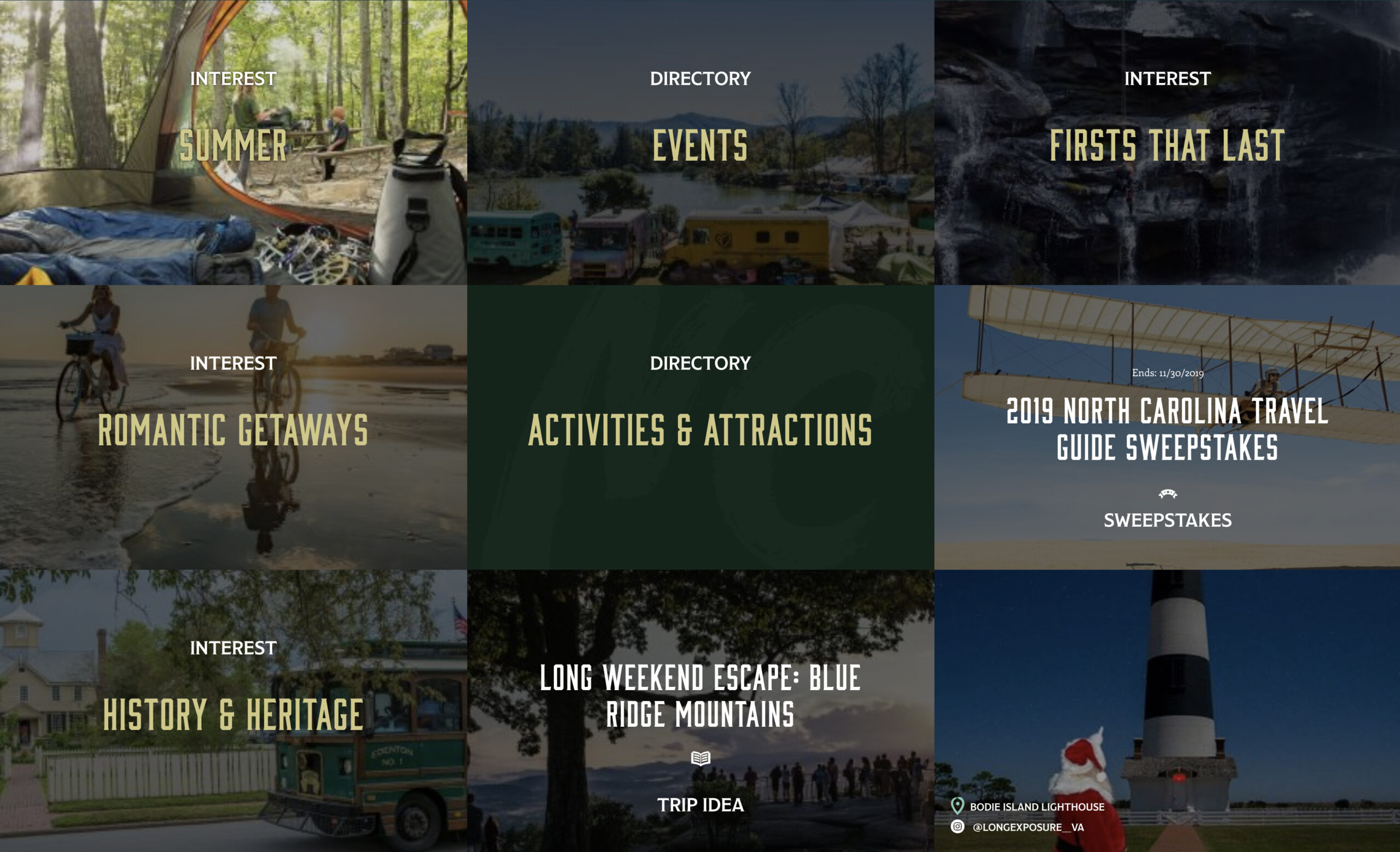
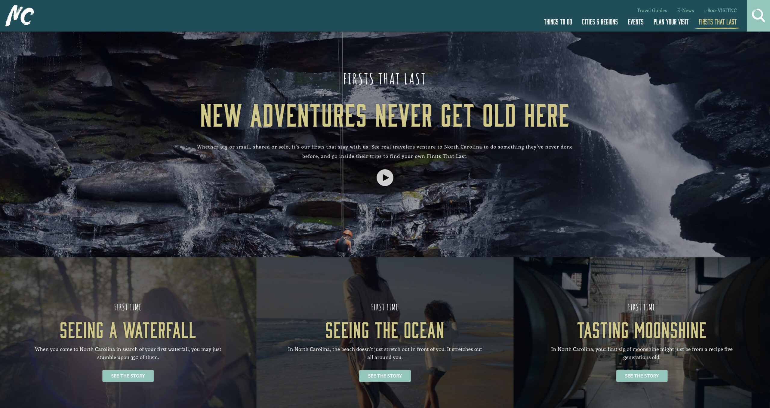
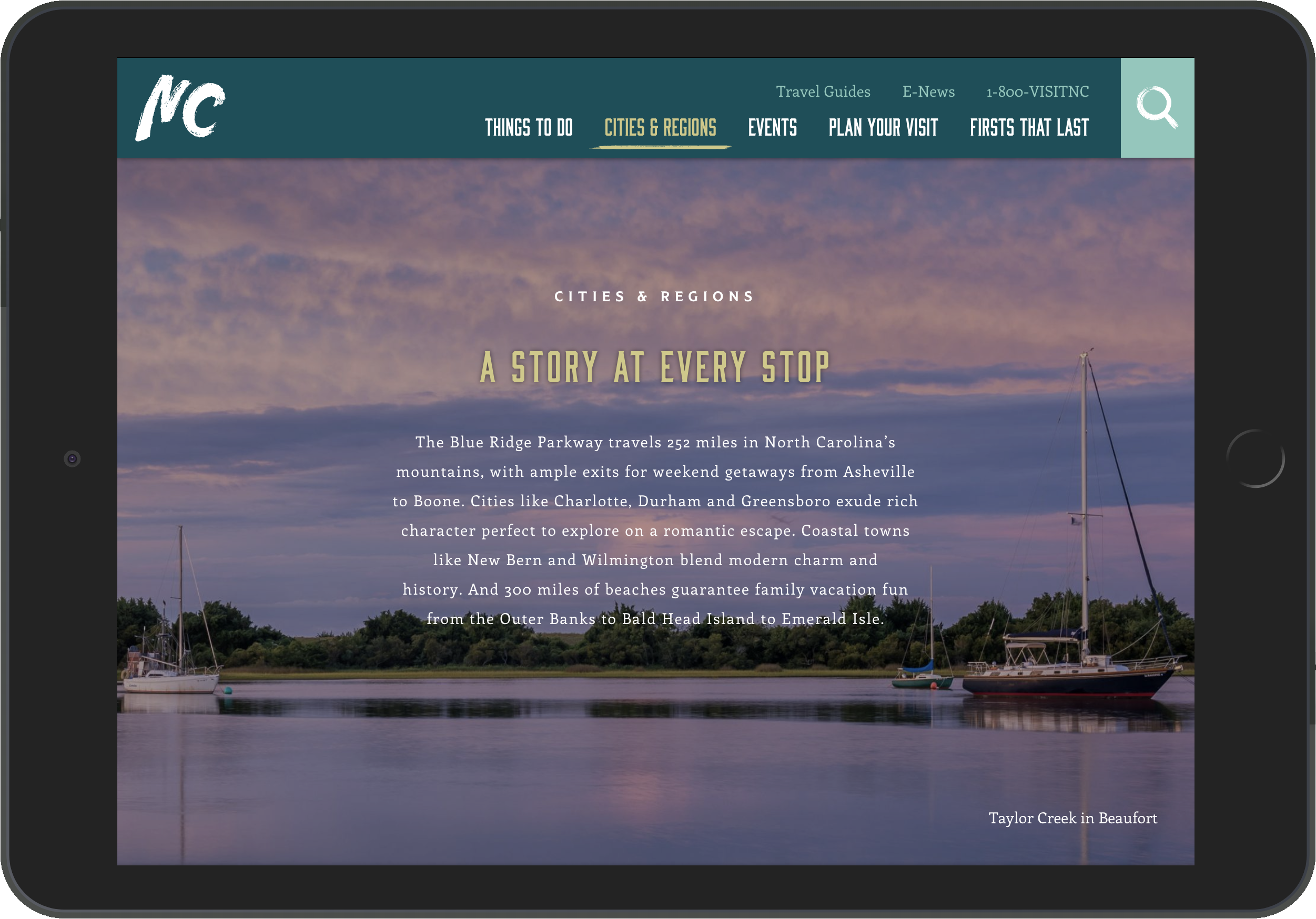
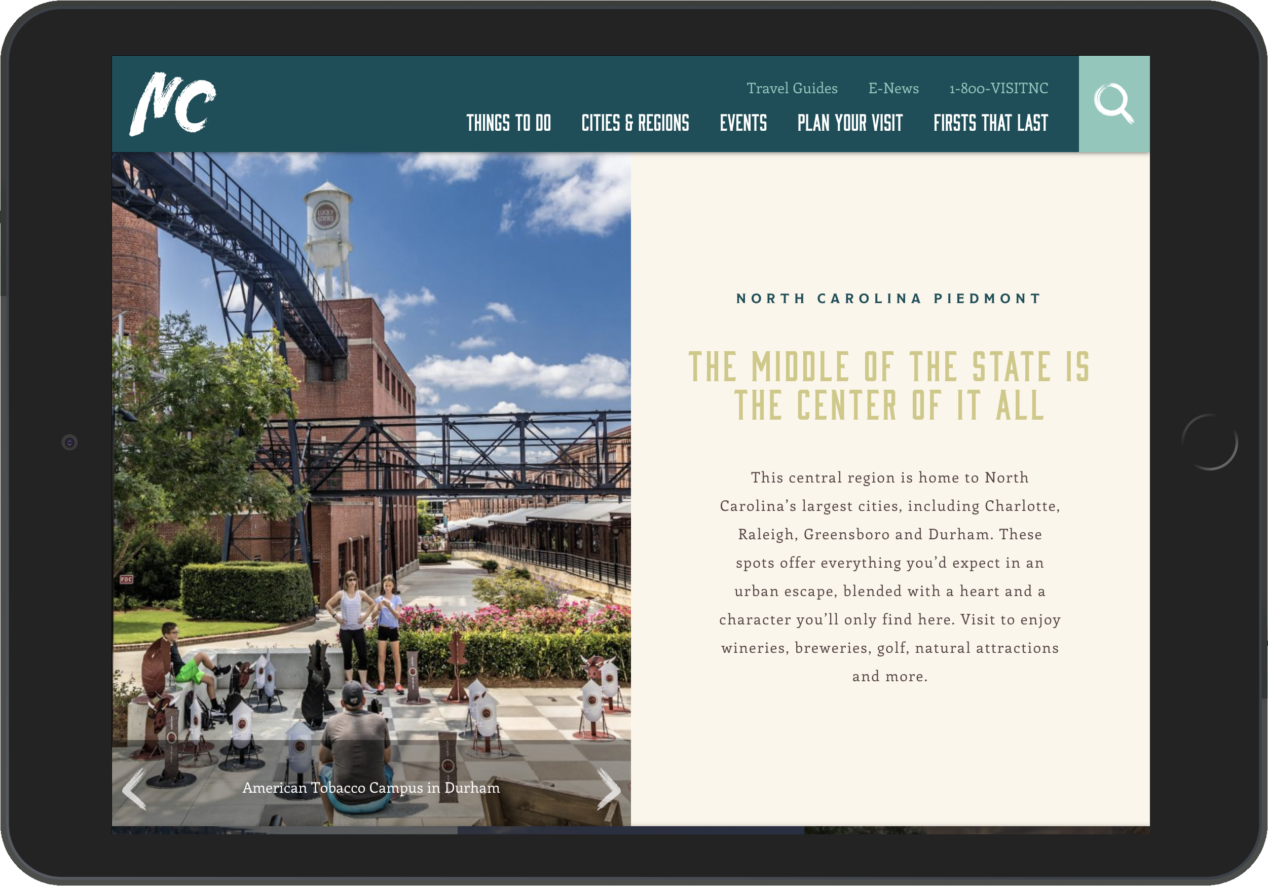
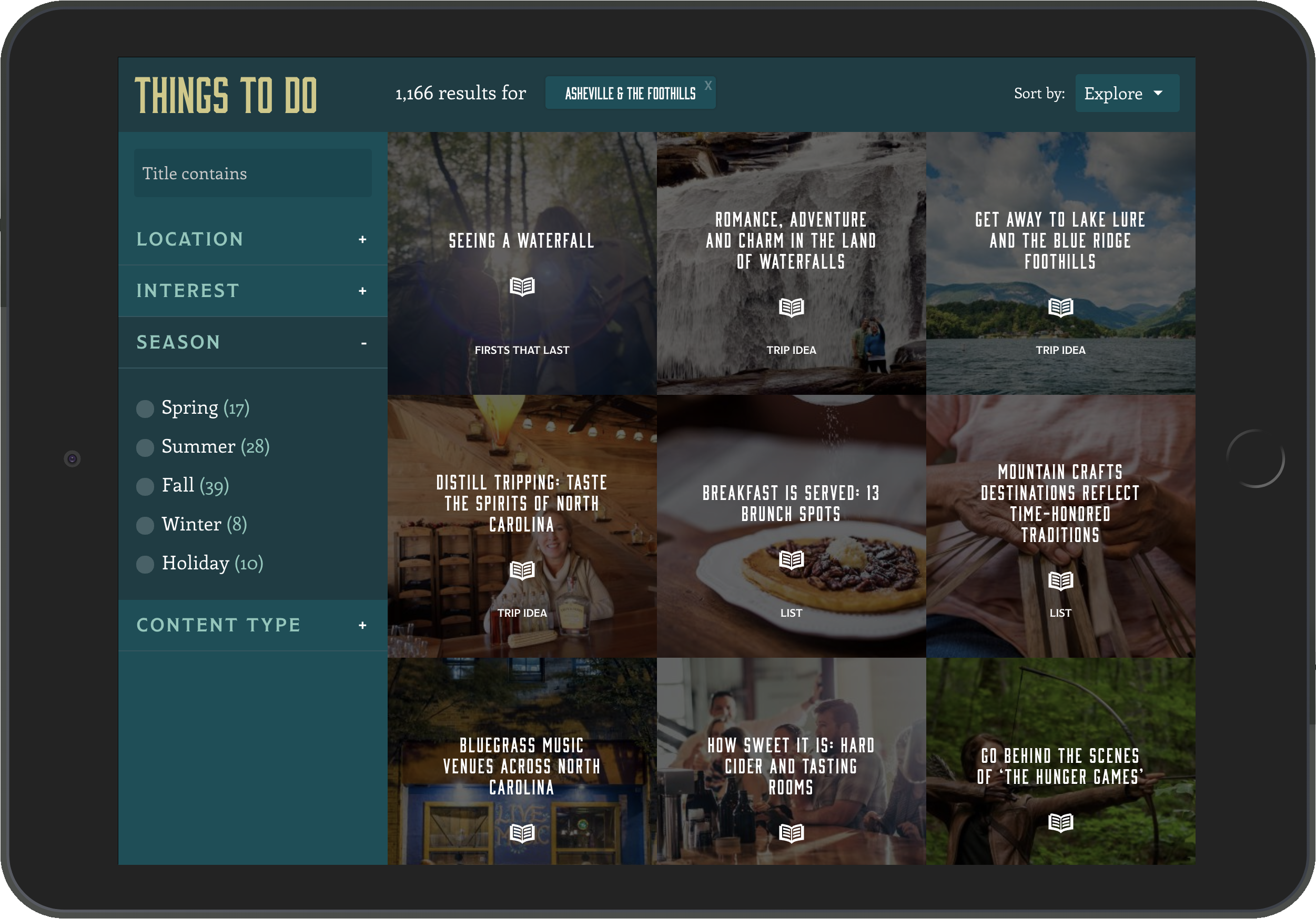
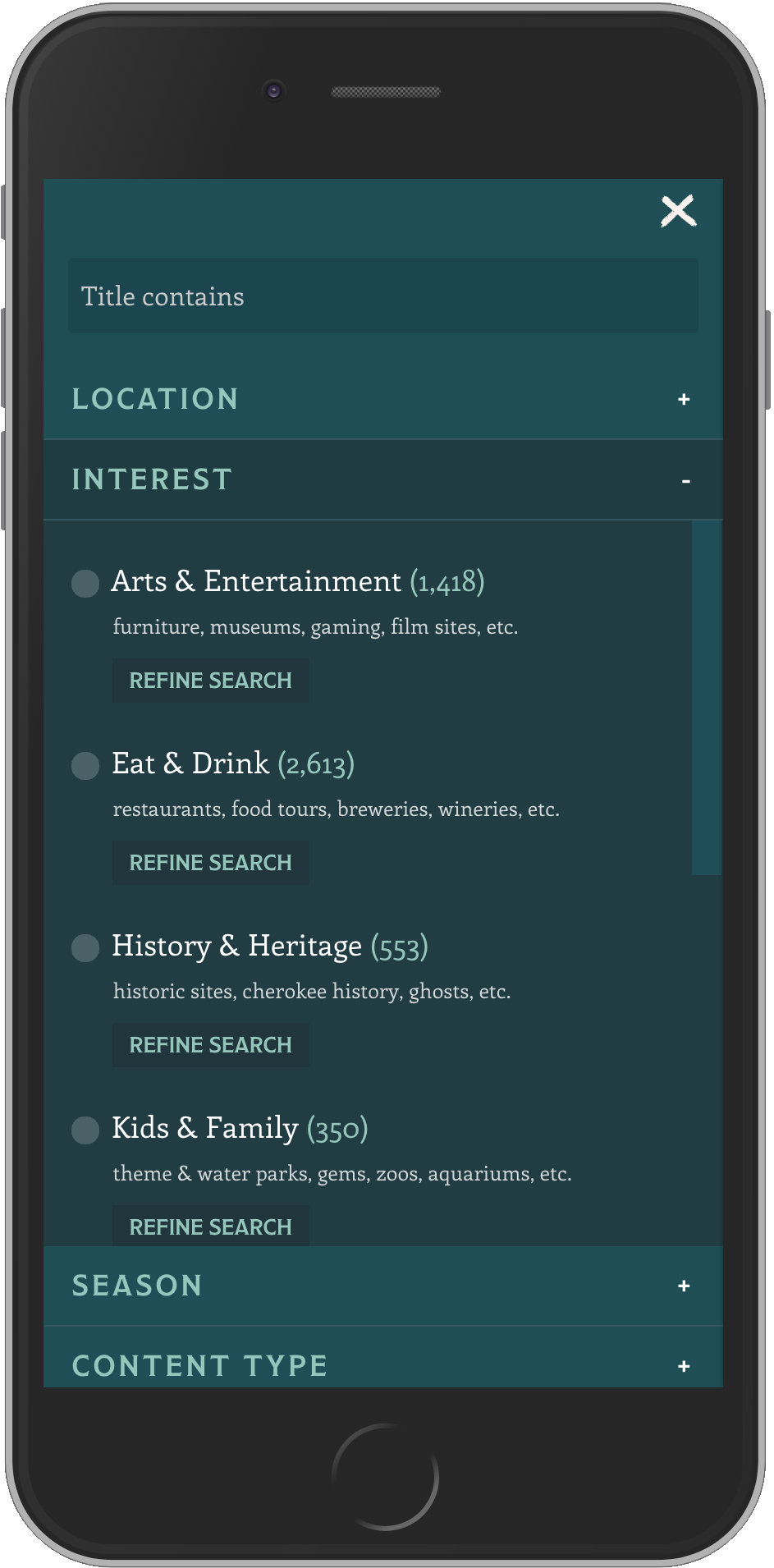
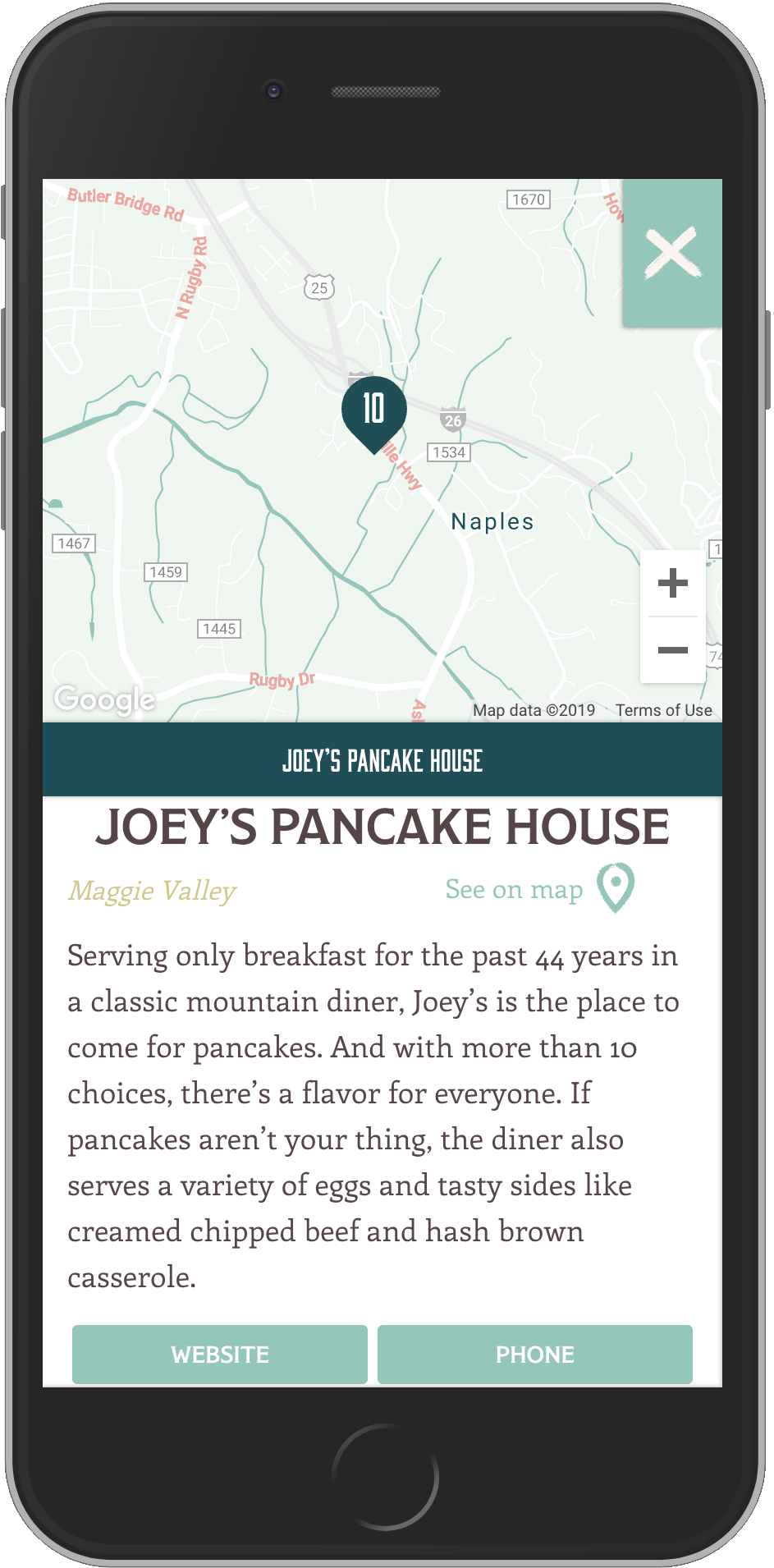
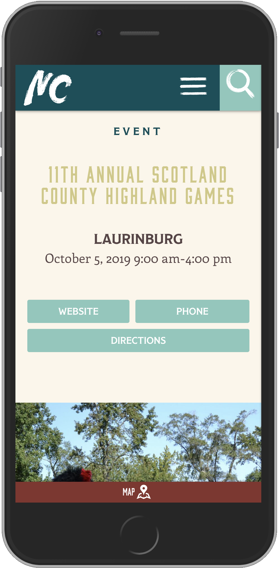
I focused on creating user experiences that balanced inspiration with usability, allowing visitors to browse naturally while always feeling oriented. Strong information architecture, thoughtful visual hierarchy, and responsive design helped transform a massive content ecosystem into an experience that felt approachable and enjoyable.
Behind every page was the same objective: help people spend less time searching and more time imagining their next trip.
The Solution
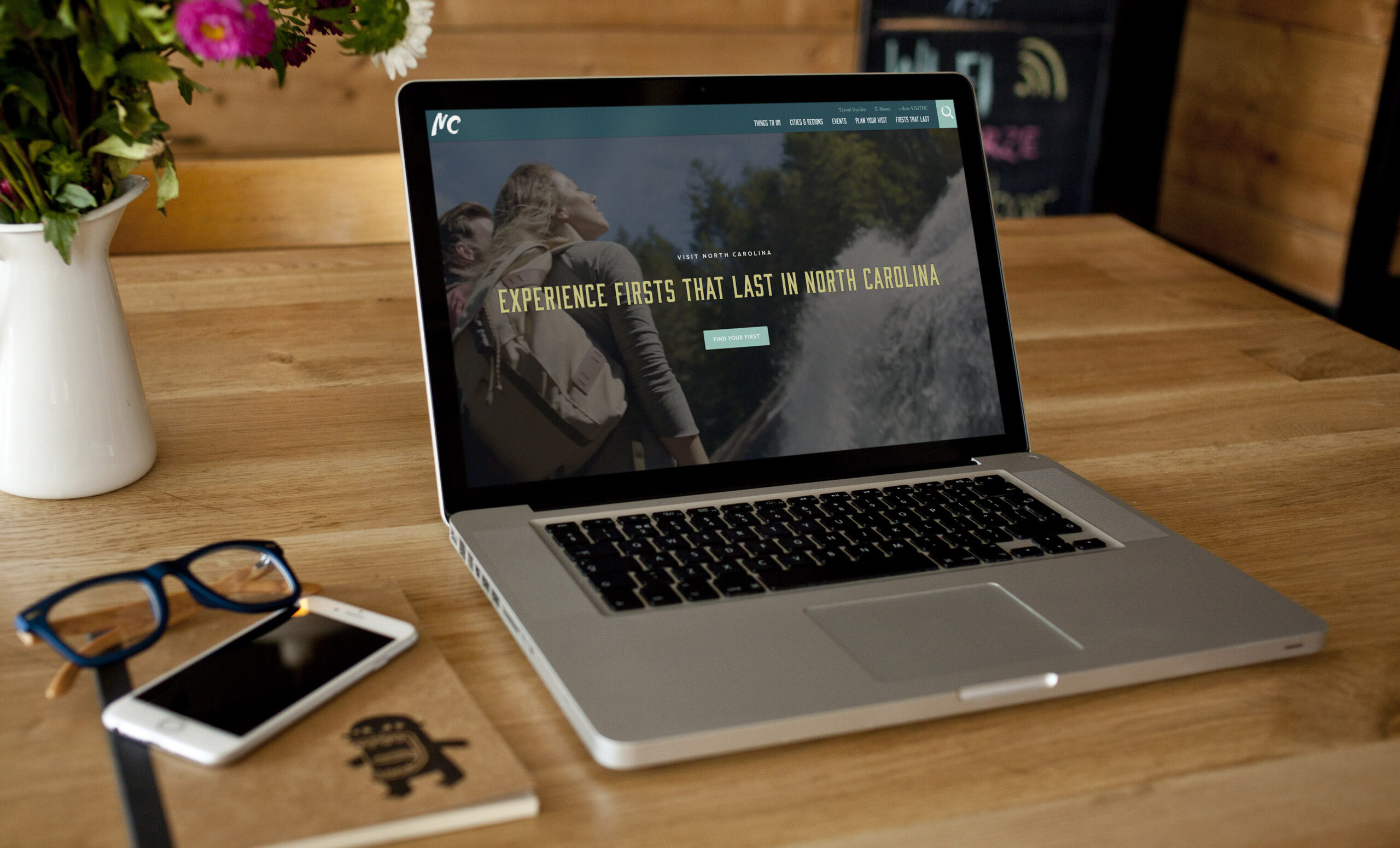
As part of the creative team behind Visit North Carolina’s digital presence, I helped shape the user experience, visual design, and ongoing evolution of a website containing more than 10,000 pages of travel content.
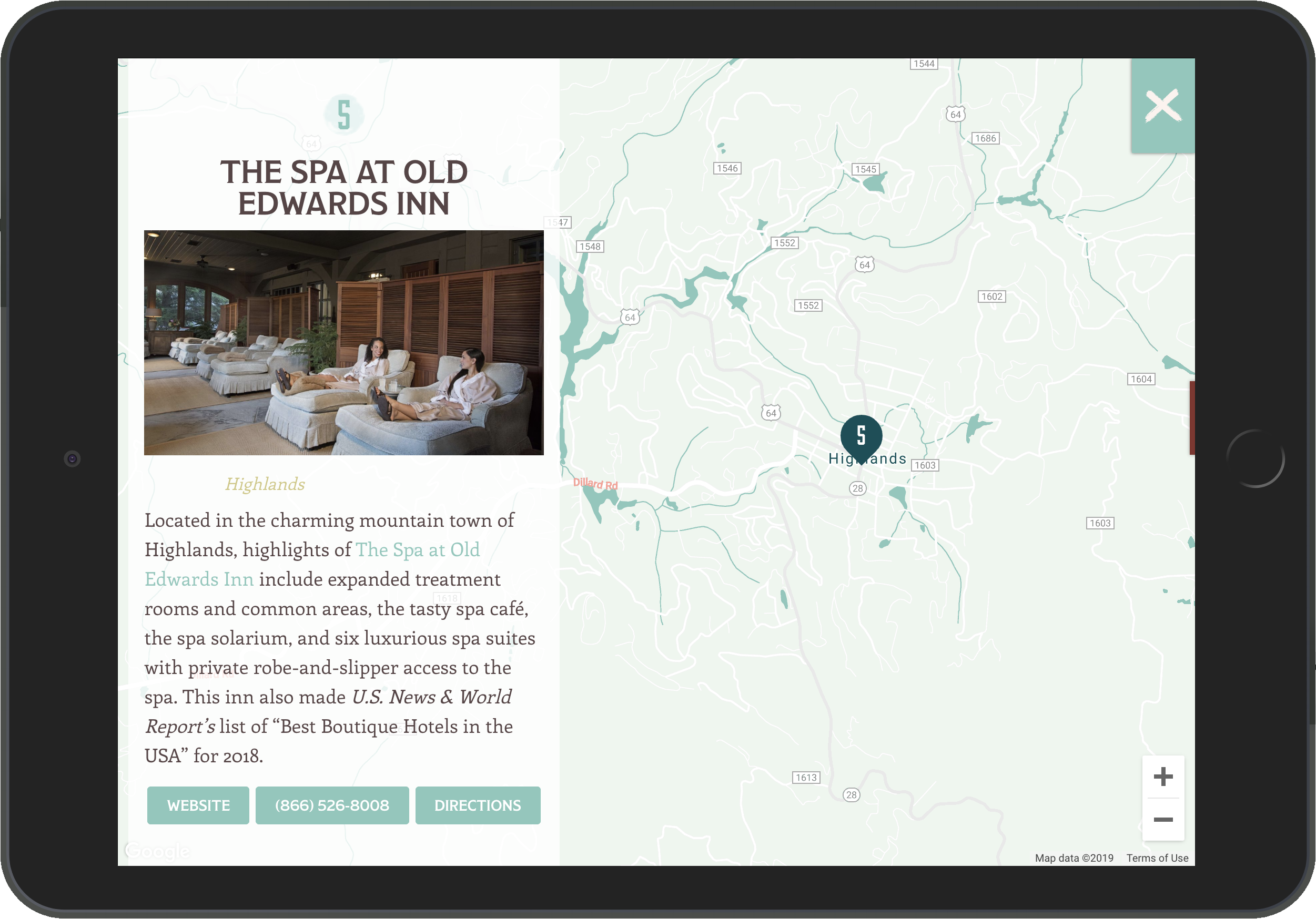
The platform serves as both an inspirational travel guide and a practical planning resource, helping visitors discover destinations, events, restaurants, lodging, and experiences across the state.
Visit North Carolina is one of only fifty official state tourism websites in the United States. Having the opportunity to help shape the digital experience for a destination at that scale was both professionally rewarding and creatively challenging.
My Role
- Digital Creative Direction
- UX Strategy
- Information Architecture
- Responsive Website Design
- User Interface Design
- Creative Collaboration
- Ongoing Product Evolution
What Made the Difference
The scale of the website wasn’t the accomplishment.
Making more than 10,000 pages feel approachable was.
By combining thoughtful user experience with editorial storytelling and intuitive navigation, the platform helped visitors focus less on finding information and more on planning memorable experiences.
Design Observation
More content doesn’t create a better experience.
Better organization does.
When information is structured around how people think instead of how organizations are organized, exploration becomes effortless.